Android Tip: Synchronously Animating Toolbar, TabLayout, and StatusBar Background Colors

Android Tip: Synchronously Animating Toolbar, TabLayout, and StatusBar Background Colors

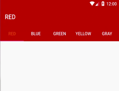
    As you can see on Google Play application, when you change selected tab on the main screen (which has 2 tabs: App & Game and Books), the TabLayout, Toolbar and Status bar background color are also changed with an animation. This effect is look like this:

    By using TabLayout widget of Design Support Library, we can make this effect easily.
    Basically, within the onTabSelected() method of my TabLayout.OnTabSelectedListener implementation, I wanted to animate from the current color to the new tab’s corresponding color, ensuring that all views are animating simultaneously. Call this interface through addOnTabSelectedListener():
tabLayout.addOnTabSelectedListener(new TabLayout.OnTabSelectedListener() {
            @Override
            public void onTabSelected(TabLayout.Tab tab) {
                //Add more code in this method later
            }

            @Override
            public void onTabUnselected(TabLayout.Tab tab) {

            }

            @Override
            public void onTabReselected(TabLayout.Tab tab) {

            }
    To do this, I chose to use the ValueAnimator which allows you to iterate over the difference of two values over a timed interval. I also used an ArgbEvaluator for the ValueAnimator’s evaluator to handle the calculation of each animation step between the two ARGB colors:
int colorFrom = ((ColorDrawable) toolbar.getBackground()).getColor();
int colorTo = getColorForTab(tab.getPosition());
    We use the toolbar’s current background color as the starting color of the animation, and determine the color to animate to based on the newly selected tab.
    Now the ValueAnimator can be used to inform us of what color to use during each animation iteration:
colorAnimation.addUpdateListener(new ValueAnimator.AnimatorUpdateListener() {
                    @Override
                    public void onAnimationUpdate(ValueAnimator animator) {
                        int color = (int) animator.getAnimatedValue();

                        toolbar.setBackgroundColor(color);
                        tabLayout.setBackgroundColor(color);

                        if (Build.VERSION.SDK_INT >= Build.VERSION_CODES.LOLLIPOP) {
                            getWindow().setStatusBarColor(color);
                        }
                    }

                });
colorAnimation.start();
    In order to setting the animation duration, you can use this code before call colorAnimation.start():
colorAnimation.setDuration(1000); //time in milliseconds
Finally, we have full code for this main activity:
MainActivity.java
package info.devexchanges.synchronouslycolor;

import android.animation.ArgbEvaluator;
import android.animation.ValueAnimator;
import android.graphics.drawable.ColorDrawable;
import android.os.Build;
import android.os.Bundle;
import android.support.design.widget.TabLayout;
import android.support.v4.content.ContextCompat;
import android.support.v7.app.AppCompatActivity;
import android.support.v7.widget.Toolbar;

public class MainActivity extends AppCompatActivity {

    private TabLayout tabLayout;
    private Toolbar toolbar;
    private String[] colors = {"Red", "Blue", "Green", "Yellow", "Gray"};

    @Override
    protected void onCreate(Bundle savedInstanceState) {
        super.onCreate(savedInstanceState);
        setContentView(R.layout.activity_main);

        tabLayout = (TabLayout) findViewById(R.id.tab_layout);
        toolbar = (Toolbar) findViewById(R.id.toolbar);

        setSupportActionBar(toolbar);

        for (String color : colors) {
            tabLayout.addTab(tabLayout.newTab().setText(color));
        }

        tabLayout.setTabGravity(TabLayout.GRAVITY_FILL);
        tabLayout.addOnTabSelectedListener(new TabLayout.OnTabSelectedListener() {
            @Override
            public void onTabSelected(TabLayout.Tab tab) {
                int colorFrom = ((ColorDrawable) toolbar.getBackground()).getColor();
                int colorTo = getColorForTab(tab.getPosition());

                ValueAnimator colorAnimation = ValueAnimator.ofObject(new ArgbEvaluator(), colorFrom, colorTo);
                colorAnimation.setDuration(1000);
                colorAnimation.addUpdateListener(new ValueAnimator.AnimatorUpdateListener() {
                    @Override
                    public void onAnimationUpdate(ValueAnimator animator) {
                        int color = (int) animator.getAnimatedValue();

                        toolbar.setBackgroundColor(color);
                        tabLayout.setBackgroundColor(color);

                        if (Build.VERSION.SDK_INT >= Build.VERSION_CODES.LOLLIPOP) {
                            getWindow().setStatusBarColor(color);
                        }
                    }

                });
                colorAnimation.start();
                toolbar.setTitle(colors[tab.getPosition()].toUpperCase());
            }

            @Override
            public void onTabUnselected(TabLayout.Tab tab) {

            }

            @Override
            public void onTabReselected(TabLayout.Tab tab) {

            }
        });
    }

    public int getColorForTab(int position) {
        if (position == 0) return ContextCompat.getColor(this, R.color.colorPrimary);
        else if (position == 1) return ContextCompat.getColor(this, R.color.blue);
        else if (position == 2) return ContextCompat.getColor(this, R.color.green);
        else if (position == 3) return ContextCompat.getColor(this, R.color.yellow);
        else return ContextCompat.getColor(this, R.color.gray);
    }
}
    And that’s all there is to it - we now have a good animation, make our app look more smoothly and prettier! This is full screen output:

    References:

Android Tip: Custom CoordinatorLayout Behavior

    In my previous post, I have presented the CoordinatorLayout in Material Design style to make some special effects with Toolbar/Action Bar like auto hide Toolbar when scroll, expanding/collapsing it, style with a "header" image,...It would be remiss if I did not mention to custom the Behavior of CoordinatorLayout. It isn't as difficult as it may seem, to begin we must take into account two core elements: child and dependency:
    The child is the view that enhances behavior, dependency who will serve as a trigger to interact with the child element. In this example, the child is the ImageView and the dependency is the Toolbar, in that way, if the Toolbar moves, the ImageView will move too.
    Please see this DEMO VIDEO, you can realize this effect appeared in a lot of applications in Google Play:

Custom the Behavior

    To custom the behavior of these elements, the first work is make a subclass of CoordinatorLayout.Behavior<T>, been T is your child class, for example: ImageView. These are methods we must override:
  • layoutDependsOn(): called every time that something happens in the layout, what we must do to return true once we identify the dependency, in the example, this method is automatically fired when the user scrolls (because the Toolbar will move), in that way we can make our child sight react accordingly. 
  • onDependentViewChanged(): Called when layoutDependsOn() return true. Here is where you must to implement our animations, translations or movements always related with the provided dependency.
    Source code of 2 methods:
    @Override
    public boolean layoutDependsOn(CoordinatorLayout parent, SimpleDraweeView child, View dependency) {
        return dependency instanceof Toolbar;
    }

    @Override
    public boolean onDependentViewChanged(CoordinatorLayout parent, SimpleDraweeView child, View dependency) {
        maybeInitProperties(child, dependency);

        final int maxScrollDistance = (int) (mStartToolbarPosition - getStatusBarHeight());
        float expandedPercentageFactor = dependency.getY() / maxScrollDistance;

        float distanceYToSubtract = ((mStartYPosition - mFinalYPosition)
                * (1f - expandedPercentageFactor)) + (child.getHeight()/2);

        float distanceXToSubtract = ((mStartXPosition - mFinalXPosition)
                * (1f - expandedPercentageFactor)) + (child.getWidth()/2);

        float heightToSubtract = ((mStartHeight - finalHeight) * (1f - expandedPercentageFactor));

        child.setY(mStartYPosition - distanceYToSubtract);
        child.setX(mStartXPosition - distanceXToSubtract);

        int proportionalAvatarSize = (int) (mAvatarMaxSize * (expandedPercentageFactor));

        CoordinatorLayout.LayoutParams lp = (CoordinatorLayout.LayoutParams) child.getLayoutParams();
        lp.width = (int) (mStartHeight - heightToSubtract);
        lp.height = (int) (mStartHeight - heightToSubtract);
        child.setLayoutParams(lp);
        return true;
    }
    Calculating the Toolbar height to placing the child view, we have full code of the custom Behavior class:
ImageBehavior.java
package info.devexchanges.customcoordiantorbehavior;

import android.annotation.SuppressLint;
import android.content.Context;
import android.support.design.widget.CoordinatorLayout;
import android.support.v7.widget.Toolbar;
import android.util.AttributeSet;
import android.view.View;

import com.facebook.drawee.view.SimpleDraweeView;

public class ImageBehavior extends CoordinatorLayout.Behavior {

    private final static float MIN_AVATAR_PERCENTAGE_SIZE   = 0.3f;
    private final static int EXTRA_FINAL_AVATAR_PADDING     = 80;

    private final static String TAG = "behavior";
    private final Context mContext;
    private float mAvatarMaxSize;

    private float mFinalLeftAvatarPadding;
    private float mStartPosition;
    private int mStartXPosition;
    private float mStartToolbarPosition;

    public ImageBehavior(Context context, AttributeSet attrs) {
        mContext = context;
        init();

        mFinalLeftAvatarPadding = context.getResources().getDimension(R.dimen.activity_horizontal_margin);
    }

    private void init() {
        bindDimensions();
    }

    private void bindDimensions() {
        mAvatarMaxSize = mContext.getResources().getDimension(R.dimen.image_width);
    }

    private int mStartYPosition;

    private int mFinalYPosition;
    private int finalHeight;
    private int mStartHeight;
    private int mFinalXPosition;

    @Override
    public boolean layoutDependsOn(CoordinatorLayout parent, SimpleDraweeView child, View dependency) {
        return dependency instanceof Toolbar;
    }

    @Override
    public boolean onDependentViewChanged(CoordinatorLayout parent, SimpleDraweeView child, View dependency) {
        maybeInitProperties(child, dependency);

        final int maxScrollDistance = (int) (mStartToolbarPosition - getStatusBarHeight());
        float expandedPercentageFactor = dependency.getY() / maxScrollDistance;

        float distanceYToSubtract = ((mStartYPosition - mFinalYPosition)
                * (1f - expandedPercentageFactor)) + (child.getHeight()/2);

        float distanceXToSubtract = ((mStartXPosition - mFinalXPosition)
                * (1f - expandedPercentageFactor)) + (child.getWidth()/2);

        float heightToSubtract = ((mStartHeight - finalHeight) * (1f - expandedPercentageFactor));

        child.setY(mStartYPosition - distanceYToSubtract);
        child.setX(mStartXPosition - distanceXToSubtract);

        int proportionalAvatarSize = (int) (mAvatarMaxSize * (expandedPercentageFactor));

        CoordinatorLayout.LayoutParams lp = (CoordinatorLayout.LayoutParams) child.getLayoutParams();
        lp.width = (int) (mStartHeight - heightToSubtract);
        lp.height = (int) (mStartHeight - heightToSubtract);
        child.setLayoutParams(lp);
        return true;
    }

    @SuppressLint("PrivateResource")
    private void maybeInitProperties(SimpleDraweeView child, View dependency) {
        if (mStartYPosition == 0)
            mStartYPosition = (int) (dependency.getY());

        if (mFinalYPosition == 0)
            mFinalYPosition = (dependency.getHeight() /2);

        if (mStartHeight == 0)
            mStartHeight = child.getHeight();

        if (finalHeight == 0)
            finalHeight = mContext.getResources().getDimensionPixelOffset(R.dimen.image_small_width);

        if (mStartXPosition == 0)
            mStartXPosition = (int) (child.getX() + (child.getWidth() / 2));

        if (mFinalXPosition == 0)
            mFinalXPosition = mContext.getResources().getDimensionPixelOffset(R.dimen.abc_action_bar_content_inset_material) + (finalHeight / 2);

        if (mStartToolbarPosition == 0)
            mStartToolbarPosition = dependency.getY() + (dependency.getHeight()/2);
    }

    public int getStatusBarHeight() {
        int result = 0;
        int resourceId = mContext.getResources().getIdentifier("status_bar_height", "dimen", "android");

        if (resourceId > 0) {
            result = mContext.getResources().getDimensionPixelSize(resourceId);
        }
        return result;
    }
}

Coding for the UI

    The next step is creating an Activity to "test" this custom Behavior. Declaring it's layout with CoordinatorLayout as root, AppBarLayout and CollapsingToolbarLayout:
activity_main.xml
<LinearLayout xmlns:android="http://schemas.android.com/apk/res/android"
    xmlns:app="http://schemas.android.com/apk/res-auto"
    xmlns:fresco="http://schemas.android.com/apk/res-auto"
    xmlns:tools="http://schemas.android.com/tools"
    android:layout_width="match_parent"
    android:layout_height="match_parent"
    android:orientation="vertical"
    tools:ignore="HardcodedText">

    <android.support.design.widget.CoordinatorLayout
        android:layout_width="match_parent"
        android:layout_height="match_parent">

        <android.support.design.widget.AppBarLayout
            android:id="@+id/appbar"
            android:layout_width="match_parent"
            android:layout_height="wrap_content"
            android:theme="@style/ThemeOverlay.AppCompat.Dark.ActionBar">

            <android.support.design.widget.CollapsingToolbarLayout
                android:id="@+id/collapsing"
                android:layout_width="match_parent"
                android:layout_height="wrap_content"
                app:layout_scrollFlags="scroll|exitUntilCollapsed|snap">

                <ImageView
                    android:id="@+id/imageview_placeholder"
                    android:layout_width="match_parent"
                    android:layout_height="300dp"
                    android:contentDescription="@string/app_name"
                    android:scaleType="centerCrop"
                    android:tint="#11000000"
                    app:layout_collapseMode="parallax"
                    app:layout_collapseParallaxMultiplier="0.9" />

                <FrameLayout
                    android:id="@+id/framelayout_title"
                    android:layout_width="match_parent"
                    android:layout_height="100dp"
                    android:layout_gravity="bottom|center_horizontal"
                    android:background="@color/colorPrimary"
                    android:orientation="vertical"
                    app:layout_collapseMode="parallax"
                    app:layout_collapseParallaxMultiplier="0.3">

                    <LinearLayout
                        android:id="@+id/linearlayout_title"
                        android:layout_width="wrap_content"
                        android:layout_height="wrap_content"
                        android:layout_gravity="center"
                        android:orientation="vertical">

                        <TextView
                            android:layout_width="wrap_content"
                            android:layout_height="wrap_content"
                            android:layout_gravity="center_horizontal"
                            android:gravity="bottom|center"
                            android:text="Grumpy Cat"
                            android:textColor="@android:color/white"
                            android:textSize="25sp" />

                        <TextView
                            android:layout_width="wrap_content"
                            android:layout_height="wrap_content"
                            android:layout_gravity="center_horizontal"
                            android:layout_marginTop="4dp"
                            android:text="The famous meme"
                            android:textColor="@android:color/white" />

                    </LinearLayout>
                </FrameLayout>
            </android.support.design.widget.CollapsingToolbarLayout>
        </android.support.design.widget.AppBarLayout>


        <android.support.v4.widget.NestedScrollView
            android:layout_width="match_parent"
            android:layout_height="match_parent"
            android:scrollbars="none"
            android:layout_marginTop="@dimen/activity_horizontal_margin"
            app:behavior_overlapTop="30dp"
            app:layout_behavior="@string/appbar_scrolling_view_behavior">

            <android.support.v7.widget.CardView
                android:layout_width="wrap_content"
                android:layout_height="wrap_content"
                android:layout_margin="8dp"
                app:cardElevation="8dp"
                app:contentPadding="16dp">

                <TextView
                    android:layout_width="match_parent"
                    android:layout_height="wrap_content"
                    android:lineSpacingExtra="8dp"
                    android:text="@string/lorem"
                    android:textSize="18sp" />
            </android.support.v7.widget.CardView>


        </android.support.v4.widget.NestedScrollView>

        <android.support.v7.widget.Toolbar
            android:id="@+id/toolbar"
            android:layout_width="match_parent"
            android:layout_height="?attr/actionBarSize"
            android:background="@color/colorPrimary"
            app:layout_anchor="@id/framelayout_title"
            app:theme="@style/ThemeOverlay.AppCompat.Dark"
            app:title="">

            <LinearLayout
                android:layout_width="wrap_content"
                android:layout_height="match_parent"
                android:orientation="horizontal">

                <Space
                    android:layout_width="@dimen/image_small_width"
                    android:layout_height="@dimen/image_small_width" />

                <TextView
                    android:id="@+id/textview_title"
                    android:layout_width="wrap_content"
                    android:layout_height="match_parent"
                    android:layout_marginLeft="8dp"
                    android:gravity="center_vertical"
                    android:text="Grumpy Cat information"
                    android:textColor="@android:color/white"
                    android:textSize="20sp" />

            </LinearLayout>
        </android.support.v7.widget.Toolbar>

        <com.facebook.drawee.view.SimpleDraweeView
            android:id="@+id/avatar"
            android:layout_width="@dimen/image_width"
            android:layout_height="@dimen/image_width"
            android:layout_gravity="center"
            app:layout_behavior="info.devexchanges.customcoordiantorbehavior.ImageBehavior"
            fresco:roundAsCircle="true" />

    </android.support.design.widget.CoordinatorLayout>
</LinearLayout>
    In programatically code, the Activity should implements AppBarLayout.OnOffsetChangedListener to defining for a callback to be invoked when an AppBarLayout's vertical offset changes:
MainActivity.java
package info.devexchanges.customcoordiantorbehavior;

import android.net.Uri;
import android.os.Bundle;
import android.support.design.widget.AppBarLayout;
import android.support.design.widget.CollapsingToolbarLayout;
import android.support.v7.app.AppCompatActivity;
import android.support.v7.widget.Toolbar;
import android.view.Menu;
import android.view.View;
import android.view.animation.AlphaAnimation;
import android.widget.FrameLayout;
import android.widget.ImageView;
import android.widget.LinearLayout;
import android.widget.TextView;

import com.facebook.drawee.backends.pipeline.Fresco;
import com.facebook.drawee.view.SimpleDraweeView;

public class MainActivity extends AppCompatActivity implements AppBarLayout.OnOffsetChangedListener {

    private static final float PERCENTAGE_TO_SHOW_TITLE_AT_TOOLBAR  = 0.9f;
    private static final float PERCENTAGE_TO_HIDE_TITLE_DETAILS     = 0.3f;
    private static final int ALPHA_ANIMATIONS_DURATION              = 200;
    final Uri imageUri = Uri.parse("http://i.imgur.com/VIlcLfg.jpg");

    private boolean mIsTheTitleVisible          = false;
    private boolean mIsTheTitleContainerVisible = true;

    private AppBarLayout appbar;
    private CollapsingToolbarLayout collapsing;
    private ImageView coverImage;
    private FrameLayout framelayoutTitle;
    private LinearLayout linearlayoutTitle;
    private Toolbar toolbar;
    private TextView textviewTitle;
    private SimpleDraweeView avatar;

    /**
     * Find the Views in the layout
     * Auto-created on 2016-03-03 11:32:38 by Android Layout Finder
     * (http://www.buzzingandroid.com/tools/android-layout-finder)
     */
    private void findViews() {
        appbar = (AppBarLayout)findViewById( R.id.appbar );
        collapsing = (CollapsingToolbarLayout)findViewById( R.id.collapsing );
        coverImage = (ImageView)findViewById( R.id.imageview_placeholder );
        framelayoutTitle = (FrameLayout)findViewById( R.id.framelayout_title );
        linearlayoutTitle = (LinearLayout)findViewById( R.id.linearlayout_title );
        toolbar = (Toolbar)findViewById( R.id.toolbar );
        textviewTitle = (TextView)findViewById( R.id.textview_title );
        avatar = (SimpleDraweeView)findViewById(R.id.avatar);
    }


    @Override
    protected void onCreate(Bundle savedInstanceState) {
        super.onCreate(savedInstanceState);
        Fresco.initialize(this);
        setContentView(R.layout.activity_main);
        findViews();

        toolbar.setTitle("");
        appbar.addOnOffsetChangedListener(this);

        setSupportActionBar(toolbar);
        startAlphaAnimation(textviewTitle, 0, View.INVISIBLE);

        //set avatar and cover
        avatar.setImageURI(imageUri);
        coverImage.setImageResource(R.drawable.cover);
    }

    @Override
    public boolean onCreateOptionsMenu(Menu menu) {
        getMenuInflater().inflate(R.menu.main, menu);
        return true;
    }

    @Override
    public void onOffsetChanged(AppBarLayout appBarLayout, int offset) {
        int maxScroll = appBarLayout.getTotalScrollRange();
        float percentage = (float) Math.abs(offset) / (float) maxScroll;

        handleAlphaOnTitle(percentage);
        handleToolbarTitleVisibility(percentage);
    }

    private void handleToolbarTitleVisibility(float percentage) {
        if (percentage >= PERCENTAGE_TO_SHOW_TITLE_AT_TOOLBAR) {

            if(!mIsTheTitleVisible) {
                startAlphaAnimation(textviewTitle, ALPHA_ANIMATIONS_DURATION, View.VISIBLE);
                mIsTheTitleVisible = true;
            }

        } else {

            if (mIsTheTitleVisible) {
                startAlphaAnimation(textviewTitle, ALPHA_ANIMATIONS_DURATION, View.INVISIBLE);
                mIsTheTitleVisible = false;
            }
        }
    }

    private void handleAlphaOnTitle(float percentage) {
        if (percentage >= PERCENTAGE_TO_HIDE_TITLE_DETAILS) {
            if(mIsTheTitleContainerVisible) {
                startAlphaAnimation(linearlayoutTitle, ALPHA_ANIMATIONS_DURATION, View.INVISIBLE);
                mIsTheTitleContainerVisible = false;
            }

        } else {

            if (!mIsTheTitleContainerVisible) {
                startAlphaAnimation(linearlayoutTitle, ALPHA_ANIMATIONS_DURATION, View.VISIBLE);
                mIsTheTitleContainerVisible = true;
            }
        }
    }

    public static void startAlphaAnimation (View v, long duration, int visibility) {
        AlphaAnimation alphaAnimation = (visibility == View.VISIBLE)
                ? new AlphaAnimation(0f, 1f)
                : new AlphaAnimation(1f, 0f);

        alphaAnimation.setDuration(duration);
        alphaAnimation.setFillAfter(true);
        v.startAnimation(alphaAnimation);
    }
}

Some necessary files

    The Option Menu in the Action Bar:
res/enu/main.xml
<?xml version="1.0" encoding="utf-8"?>
<menu xmlns:android="http://schemas.android.com/apk/res/android"
    xmlns:app="http://schemas.android.com/apk/res-auto">

    <item
        android:id="@+id/setting"
        android:title="@string/app_name"
        app:showAsAction="never"/>

    <item android:id="@+id/menu_share"
        android:icon="@drawable/like"
        app:showAsAction="ifRoom"
        android:title="@string/app_name" />
</menu>
    The strings resource:
strings.xml

<resources>
    <string name="app_name">Custom Coordiantor Behavior</string>
    <string name="lorem">
        Lorem ipsum dolor sit amet, consectetur adipiscing elit. Donec vehicula sem a malesuada rhoncus. Pellentesque ut dolor a dui porttitor porta lacinia non libero. Nunc volutpat arcu quis quam convallis molestie. Etiam ac tristique sem, id commodo justo. Phasellus congue tincidunt lectus, at dignissim ligula maximus eu. Quisque interdum nunc eget tellus bibendum suscipit. Phasellus feugiat ultricies posuere. Nullam porta accumsan velit, ut rutrum massa fermentum eu. Nunc ac bibendum nunc. Mauris eu ultricies ipsum. Ut id dolor dui. Pellentesque dictum dui vel tempus maximus. Vivamus non nisi quis libero scelerisque pretium. Ut eu tristique justo. Sed pellentesque placerat quam, ut ultricies turpis feugiat a. Aliquam a volutpat risus.
    </string>
</resources>
    Styles resource, make sure that you use Theme.AppCompat.Light.NoActionBar for this example:
styles.xml
<resources>

    <style name="AppTheme" parent="Theme.AppCompat.Light.NoActionBar">
        <item name="colorPrimary">@color/colorPrimary</item>
        <item name="colorPrimaryDark">@color/colorPrimaryDark</item>
        <item name="colorAccent">@color/colorAccent</item>
    </style>

</resources>
The dimensions resource:
dimens.xml
<resources>
    <dimen name="activity_horizontal_margin">16dp</dimen>
    <dimen name="activity_vertical_margin">16dp</dimen>
    <dimen name="image_width">110dp</dimen>
    <dimen name="image_small_width">32dp</dimen>
</resources>
    Running app, you will see this output, like Facebook profile page:
    Note: In this example, the view class use in custom Behavior is SimpleDraweeView, a sub class of ImageView in Facebook Fresco library. So, in order to use it, you must put this dependency to app/build.gradle:
compile 'com.facebook.fresco:fresco:0.9.0'
    Because of getting "avatar" from an URL, so you must provide Internet permission in AndroidManifest.xml:
<uses-permission android:name="android.permission.INTERNET" />

Conclusions

    Material Design bring us a lot of design effects and styles. With them, we can make our apps more exciting. Please read "Toolbar animations" post to find out another effects or check this tag link to read all post about Material Design technology.
    Reference to official docs:
- CoordinatorLayout.
- Toolbar.
- CollapsingToolbarLayout.
- AppBarLayout.

Material Design TabLayout and Toolbar animation (show/hide) when scrolling screen

Material Design TabLayout and Toolbar animation (show/hide) when scrolling screen

    In previous post, I have presented the expanding/collapsing animations with Toolbar when scrolling the screen (the screen's content is RecyclerView or NestedScrollView). Today, I will talk about a popular layout: Tab bar. With TabLayout of Design Support Library, you can make a swipe view with tab easily. Now, by this post, I present  how to hiding/showing it and Toolbar (work as Action Bar) when your content can be scrolled.

Prerequisites

    Firstly, in order to use these widget, adding Design Support Library dependency into your module build.gradle:
compile 'com.android.support:design:23.4.0'
Make sure that you use a "no Action Bar theme" for your project:
styles.xml
<resources>

    <style name="AppTheme" parent="Theme.AppCompat.Light.NoActionBar">
        <item name="colorPrimary">@color/colorPrimary</item>
        <item name="colorPrimaryDark">@color/colorPrimaryDark</item>
        <item name="colorAccent">@color/colorAccent</item>
    </style>

    <style name="MyCustomTabLayout" parent="Widget.Design.TabLayout">
        <item name="tabTextAppearance">@style/MyCustomTabText</item>
        <item name="tabBackground">@drawable/tab_layout</item>
        <item name="tabSelectedTextColor">#ff0000</item>
    </style>

    <style name="MyCustomTabText" parent="TextAppearance.AppCompat.Button">
        <item name="android:textSize">13sp</item>
        <item name="android:textAllCaps">false</item>
        <item name="android:textColor">@android:color/holo_blue_dark</item>
    </style>

</resources>
    I will use MyCustomTabLayout for styling the TabLayout then.

Hide TabLayout and Toolbar when scroll

    Now, follow these steps in designing layout (xml file), we will set both TabLayout and Toolbar are hidden when user scroll screen:
  • Make CoordinatorLayout as the root view.
  • Wrapping Toolbar and TabLayout in AppBarLayout.
  • Adding app:layout_scrollFlags="scroll|enterAlways" attribute to Toolbar and TabLayout.
  • Adding  app:layout_behavior="@string/appbar_scrolling_view_behavior" to ViewPager. This attribute will trigger event in the Toolbar.
    And we have the activity layout like this:
activity_main.xml
<android.support.design.widget.CoordinatorLayout xmlns:android="http://schemas.android.com/apk/res/android"
    xmlns:app="http://schemas.android.com/apk/res-auto"
    android:layout_width="match_parent"
    android:layout_height="wrap_content">

    <android.support.design.widget.AppBarLayout
        android:layout_width="match_parent"
        android:layout_height="wrap_content"
        android:theme="@style/ThemeOverlay.AppCompat.Dark">

        <android.support.v7.widget.Toolbar
            android:id="@+id/toolbar"
            android:layout_width="match_parent"
            android:layout_height="?attr/actionBarSize"
            app:layout_scrollFlags="scroll|enterAlways" />

        <android.support.design.widget.TabLayout
            android:id="@+id/tab_layout"
            android:layout_width="match_parent"
            android:layout_height="wrap_content"
            android:background="@color/colorPrimary"
            app:layout_scrollFlags="scroll|enterAlways" />
    </android.support.design.widget.AppBarLayout>

    <android.support.v4.view.ViewPager
        android:id="@+id/view_pager"
        android:layout_width="match_parent"
        android:layout_height="match_parent"
        app:layout_behavior="@string/appbar_scrolling_view_behavior" />
</android.support.design.widget.CoordinatorLayout>
    In programmatically code, we'll populating tabs and do another necessary works. This is activity full source:
MainActivity.java
package info.devexchanges.tablayout;

import android.os.Bundle;
import android.support.design.widget.TabLayout;
import android.support.v4.app.Fragment;
import android.support.v4.app.FragmentManager;
import android.support.v4.app.FragmentPagerAdapter;
import android.support.v4.view.ViewPager;
import android.support.v7.app.AppCompatActivity;
import android.support.v7.widget.Toolbar;
import android.view.View;

public class MainActivity extends AppCompatActivity {

    private Toolbar toolbar;
    private TabLayout tabLayout;
    private ViewPager viewPager;

    private void findViews() {
        toolbar = (Toolbar) findViewById(R.id.toolbar);
        tabLayout = (TabLayout) findViewById(R.id.tab_layout);
        viewPager = (ViewPager) findViewById(R.id.view_pager);
    }

    @Override
    protected void onCreate(Bundle savedInstanceState) {
        super.onCreate(savedInstanceState);
        setContentView(R.layout.activity_tab);
        findViews();
        setSupportActionBar(toolbar);

        //create and set ViewPager adapter
        ViewPagerAdapter adapter = new ViewPagerAdapter(getSupportFragmentManager());
        viewPager.setAdapter(adapter);

        //create tabs title
        tabLayout.addTab(tabLayout.newTab().setText("Fragment 1"));
        tabLayout.addTab(tabLayout.newTab().setText("Fragment 2"));

        //attach tab layout with ViewPager
        //set gravity for tab bar
        tabLayout.setTabGravity(TabLayout.GRAVITY_FILL);
        tabLayout.setTabMode(TabLayout.MODE_FIXED);

        //change selected tab when viewpager changed page
        viewPager.addOnPageChangeListener(new TabLayout.TabLayoutOnPageChangeListener(tabLayout));

        //change viewpager page when tab selected
        tabLayout.setOnTabSelectedListener(new TabLayout.OnTabSelectedListener() {
            @Override
            public void onTabSelected(TabLayout.Tab tab) {
                viewPager.setCurrentItem(tab.getPosition());
            }

            @Override
            public void onTabUnselected(TabLayout.Tab tab) {

            }

            @Override
            public void onTabReselected(TabLayout.Tab tab) {

            }
        });
    }

    private class ViewPagerAdapter extends FragmentPagerAdapter {

        public ViewPagerAdapter(FragmentManager fm) {
            super(fm);
        }

        @Override
        public Fragment getItem(int position) {
            return new ContentFragment();
        }

        @Override
        public int getCount() {
            return 2;
        }
    }
}
    And code for each Fragment:
ContentFragment.java
package info.devexchanges.tablayout;

import android.os.Bundle;
import android.support.annotation.Nullable;
import android.support.v4.app.Fragment;
import android.view.LayoutInflater;
import android.view.View;
import android.view.ViewGroup;

public class ContentFragment extends Fragment {

    @Nullable
    @Override
    public View onCreateView(LayoutInflater inflater, @Nullable ViewGroup container, @Nullable Bundle savedInstanceState) {
        return inflater.inflate(R.layout.fragment_content, container, false);
    }

    @Override
    public void onViewCreated(View view, @Nullable Bundle savedInstanceState) {
        super.onViewCreated(view, savedInstanceState);
    }
}
The Fragment's layout:
fragment_conent.xml
<?xml version="1.0" encoding="utf-8"?>
<android.support.v4.widget.NestedScrollView xmlns:android="http://schemas.android.com/apk/res/android"
    android:layout_width="match_parent"
    android:layout_height="match_parent">

    <TextView
        android:id="@+id/text"
        android:layout_width="match_parent"
        android:layout_height="wrap_content"
        android:padding="@dimen/activity_horizontal_margin"
        android:text="@string/lorem_ipsum" />

</android.support.v4.widget.NestedScrollView>
    Running app, we have this output:

Hide Toolbar and keep TabLayout

    Removing app:layout_scrollFlags attribute from TabLayout, we'll done this requirement:

Hide TabLayout and keep Toolbar when scroll

    This requirement is a bit more difficult. We should wrap TabLayout in CollapsingToolbarLayout, putting Toolbar and TabLayout in to 2 separated AppBarLayouts:
activity_main.xml
<RelativeLayout xmlns:android="http://schemas.android.com/apk/res/android"
    xmlns:app="http://schemas.android.com/apk/res-auto"
    android:layout_width="match_parent"
    android:layout_height="match_parent">

    <android.support.design.widget.AppBarLayout
        android:id="@+id/id_toolbar_container"
        android:layout_width="match_parent"
        android:layout_height="wrap_content"
        android:fitsSystemWindows="true"
        android:theme="@style/ThemeOverlay.AppCompat.Dark">

        <android.support.v7.widget.Toolbar
            android:id="@+id/toolbar"
            android:layout_width="match_parent"
            android:layout_height="?attr/actionBarSize"
            app:layout_collapseMode="pin"
            app:layout_scrollFlags="scroll|exitUntilCollapsed" />
    </android.support.design.widget.AppBarLayout>

    <android.support.design.widget.CoordinatorLayout
        android:id="@+id/main_content"
        android:layout_width="match_parent"
        android:layout_height="match_parent"
        android:layout_below="@id/id_toolbar_container">

        <android.support.design.widget.AppBarLayout
            android:id="@+id/app_bar"
            android:layout_width="match_parent"
            android:layout_height="wrap_content"
            android:theme="@style/ThemeOverlay.AppCompat.Dark">

            <android.support.design.widget.CollapsingToolbarLayout
                android:layout_width="match_parent"
                android:layout_height="wrap_content"
                app:layout_scrollFlags="scroll|enterAlways">

                <android.support.design.widget.TabLayout
                    android:id="@+id/tab_layout"
                    android:layout_width="match_parent"
                    android:layout_height="?attr/actionBarSize" />
            </android.support.design.widget.CollapsingToolbarLayout>

        </android.support.design.widget.AppBarLayout>

        <android.support.v4.view.ViewPager
            android:id="@+id/view_pager"
            android:layout_width="match_parent"
            android:layout_height="match_parent"
            app:layout_behavior="@string/appbar_scrolling_view_behavior" />

    </android.support.design.widget.CoordinatorLayout>
</RelativeLayout>
And this is output:

Conclusions

    In this tip, I've present some options for Toolbar and TabLayout. This is often called scrolling techniques of Material Design (please read my previous post to know more). From this, I hope that readers can choose a suitable scrolling style with your Action Bar and Tab bar in your own application. Finally, thanks for reading!
Android Tip: SearchView below ActionBar/Toolbar

Android Tip: SearchView below ActionBar/Toolbar

    In some applications, they have a widget below Action Bar title like a Search View, the worth mentioning here that it make us feel that the View seem belongs to the Action Bar (because they look like in one block)! Through this post, I will present the way to make a layout like this:

Prerequisites

    We should use Toolbar as an Action Bar, so please use a "No Action Bar" theme:
styles.xml
<resources>

    <!-- Base application theme. -->
    <style name="AppTheme" parent="Theme.AppCompat.Light.NoActionBar">
        <!-- Customize your theme here. -->
        <item name="colorPrimary">@color/colorPrimary</item>
        <item name="colorPrimaryDark">@color/colorPrimaryDark</item>
        <item name="colorAccent">@color/colorAccent</item>
    </style>

</resources>

Building layout

    In this sample layout, I put a SearchView below Toolbar:
activity_main.xml
<?xml version="1.0" encoding="utf-8"?>
<RelativeLayout xmlns:android="http://schemas.android.com/apk/res/android"
    xmlns:app="http://schemas.android.com/apk/res-auto"
    android:layout_width="match_parent"
    android:layout_height="match_parent">

    <android.support.v7.widget.Toolbar
        android:id="@+id/toolbar"
        android:layout_width="match_parent"
        android:layout_height="?attr/actionBarSize"
        android:background="@color/colorPrimary"
        app:popupTheme="@style/ThemeOverlay.AppCompat.Light"
        app:theme="@style/ThemeOverlay.AppCompat.Dark.ActionBar" />

    <RelativeLayout
        android:id="@+id/search_layout"
        android:layout_width="match_parent"
        android:layout_height="wrap_content"
        android:layout_below="@+id/toolbar"
        android:background="@color/colorPrimary"
        android:padding="@dimen/activity_horizontal_margin">

        <android.support.v7.widget.SearchView
            android:id="@+id/search_view"
            android:layout_width="match_parent"
            android:layout_height="wrap_content"
            android:background="@drawable/corners"
            app:queryHint="Type something..." />
    </RelativeLayout>

    <TextView
        android:layout_width="match_parent"
        android:layout_height="wrap_content"
        android:layout_below="@id/search_layout"
        android:padding="@dimen/activity_horizontal_margin"
        android:text="@string/short_text" />

</RelativeLayout>
    The important note here is you must set SearchView background same as Toolbar's. For this layout, the background color is colorPrimary. In programmatically code, set Toolbar as Action Bar and locating Options menu like another app:
MainActivity.java
package info.devexchanges.searchbarbelowtoolbar;

import android.support.v7.app.AppCompatActivity;
import android.os.Bundle;
import android.support.v7.widget.Toolbar;
import android.view.Menu;

public class MainActivity extends AppCompatActivity {

    @Override
    protected void onCreate(Bundle savedInstanceState) {
        super.onCreate(savedInstanceState);
        setContentView(R.layout.activity_main);

        Toolbar toolbar = (Toolbar)findViewById(R.id.toolbar);
        setSupportActionBar(toolbar);
    }

    @Override
    public boolean onCreateOptionsMenu(Menu menu) {
        getMenuInflater().inflate(R.menu.main, menu);
        return super.onCreateOptionsMenu(menu);
    }
}
    Running application, we have this output:
    As you can see, Action Bar and Search View look like locating in one block!

More complicated layout

    With this style, we can realize that "the Action Bar region" take a large area in the display. It's not a good design when the main content is much complicated (for example, the main content can be scrolled). So, in this case, we can hide the Toolbar when scrolling the screen, our UX maybe better. In order to making this effect, follow these step:
  • Set the root layout is CoordinatorLayout.
  • Put Toolbar into AppBarLayout
  • Set app:layout_scrollFlags="scroll|enterAlways" for the Toolbar, it will disappear when scrolling screen. 
  • And the last, put your TextView inside NestedScrollView
And this is full layout code (xml file):
activity_main.xml
<?xml version="1.0" encoding="utf-8"?>
<android.support.design.widget.CoordinatorLayout xmlns:android="http://schemas.android.com/apk/res/android"
    xmlns:app="http://schemas.android.com/apk/res-auto"
    android:id="@+id/main_content"
    android:layout_width="match_parent"
    android:layout_height="match_parent"
    android:focusableInTouchMode="true"
    android:fitsSystemWindows="true">

    <android.support.v4.widget.NestedScrollView
        android:layout_width="match_parent"
        android:layout_height="match_parent">

        <TextView
            android:layout_width="match_parent"
            android:layout_height="wrap_content"
            android:padding="@dimen/activity_horizontal_margin"
            android:text="@string/long_text" />
    </android.support.v4.widget.NestedScrollView>

    <android.support.design.widget.AppBarLayout
        android:layout_width="match_parent"
        android:layout_height="wrap_content"
        android:theme="@style/ThemeOverlay.AppCompat.Dark">

        <android.support.v7.widget.Toolbar
            android:id="@+id/toolbar"
            android:layout_width="match_parent"
            android:layout_height="?attr/actionBarSize"
            android:background="@color/colorPrimary"
            app:layout_scrollFlags="scroll|enterAlways"
            app:popupTheme="@style/ThemeOverlay.AppCompat.Light"
            app:theme="@style/ThemeOverlay.AppCompat.Dark.ActionBar" />

        <RelativeLayout
            android:id="@+id/search_layout"
            android:layout_width="match_parent"
            android:layout_height="wrap_content"
            android:layout_below="@+id/toolbar"
            android:background="@color/colorPrimary"
            android:padding="@dimen/activity_horizontal_margin">

            <EditText
                android:layout_width="match_parent"
                android:layout_height="wrap_content"
                android:background="@drawable/corners"
                android:drawableLeft="@android:drawable/ic_menu_camera"
                android:drawablePadding="22dp"
                android:drawableRight="@android:drawable/ic_menu_search"
                android:gravity="left|center"
                android:hint="Type some text..."
                android:padding="10dp"
                android:textColorHint="@android:color/darker_gray" />
        </RelativeLayout>

    </android.support.design.widget.AppBarLayout>

</android.support.design.widget.CoordinatorLayout>
    You should change SearchView to EditText, it better compatibility with AppBarLayout. Running app, we have this output:

Final thoughts

    Now, you know how to make a "multi-line Action Bar" with putting a widget below it. Moreover, you can read this post to find out some exciting Toolbar animations. With Material Design technology, we can make a lot of interesting UIs, you should read this official document to deep understanding this powerful design style from Google.

ListView with Parallax Header Android

     As you can see at my previous post (about make Parallax Toolbar), with Material Design style, developer can make a lot of animations with Toolbar/ActionBar when scrolling screen. Unfortunately, we can only make them with RecyclerView or NestedScrollView, it is a pity that ListView and other "traditional" scrollable views have not been supported. If we would like to create these effections, we must handle ListView scroll event (through OnScrollListener). Today, in this post, I will provide a solution to make ListView with parallax header, please see this DEMO VIDEO to see output first:

Design layouts

    Firstly, providing activity layout contains a ListView and ImageView included in a FrameLayout as root view (always use FrameLayout, remember!):
    TextView in this layout acts as ListView header then.
    Now, design a "reality" ListView header, only includes two Spaces (subclass of View, used to occupy invisible, transparent space on the screen):
    These two Spaces height must be same with ImageView and TextView in activity layout, these invisible views will be useful to calculate the view position and will help to create the parallax effect.
    Adding a layout for each ListView item to complete xml design:
    Always providing a background for each rows like above, when ListView scrolled, this background will cover the ImageView.

Activity programmatically code

    Handling ListView scroll event is the point in code. We will check if the first ListView item is reached to top and set image header scrolls half of the amount that of ListView:
private AbsListView.OnScrollListener onScrollListener () {
        return new AbsListView.OnScrollListener() {

            @Override
            public void onScrollStateChanged(AbsListView view, int scrollState) {
            }

            @Override
            public void onScroll(AbsListView view, int firstVisibleItem, int visibleItemCount, int totalItemCount) {

                // Check if the first item is already reached to top
                if (listView.getFirstVisiblePosition() == 0) {
                    View firstChild = listView.getChildAt(0);
                    int topY = 0;
                    if (firstChild != null) {
                        topY = firstChild.getTop();
                    }

                    int headerTopY = headerSpace.getTop();
                    headerText.setY(Math.max(0, headerTopY + topY));

                    // Set the image to scroll half of the amount that of ListView
                    headerView.setY(topY * 0.5f);
                }
            }
        };
    }

Final code

    Over here, impotant codes have done. Adding some necessary methods, we have complete activity code:
package info.devexchanges.parallaxheaderlistview;

import android.annotation.SuppressLint;
import android.content.Context;
import android.os.Bundle;
import android.support.v7.app.AppCompatActivity;
import android.view.LayoutInflater;
import android.view.View;
import android.widget.AbsListView;
import android.widget.ArrayAdapter;
import android.widget.ListView;
import android.widget.TextView;
import java.util.ArrayList;
import java.util.List;

public class MainActivity extends AppCompatActivity {

    private TextView headerText;
    private ListView listView;
    private View headerView;
    private View headerSpace;

    @Override
    protected void onCreate(Bundle savedInstanceState) {
        super.onCreate(savedInstanceState);
        setContentView(R.layout.activity_main);

        listView = (ListView) findViewById(R.id.list_view);
        headerView = findViewById(R.id.header_image_view);
        headerText = (TextView) findViewById(R.id.header_text);

        setListViewHeader();
        setListViewData();

        // Handle list View scroll events
        listView.setOnScrollListener(onScrollListener());
    }

    private void setListViewHeader() {
        LayoutInflater inflater = (LayoutInflater) getSystemService(Context.LAYOUT_INFLATER_SERVICE);
        @SuppressLint("InflateParams") View listHeader = inflater.inflate(R.layout.listview_header, null, false);
        headerSpace = listHeader.findViewById(R.id.header_space);

        listView.addHeaderView(listHeader);
    }

    private void setListViewData() {
        List<String> modelList = new ArrayList<>();
        for (int i = 0; i < 20; i++) {
            modelList.add("Item " + (i+1));
        }

        ArrayAdapter<String> adapter = new ArrayAdapter<>(this, R.layout.item_listview, R.id.item, modelList);
        listView.setAdapter(adapter);
    }

    private AbsListView.OnScrollListener onScrollListener () {
        return new AbsListView.OnScrollListener() {

            @Override
            public void onScrollStateChanged(AbsListView view, int scrollState) {
            }

            @Override
            public void onScroll(AbsListView view, int firstVisibleItem, int visibleItemCount, int totalItemCount) {

                // Check if the first item is already reached to top
                if (listView.getFirstVisiblePosition() == 0) {
                    View firstChild = listView.getChildAt(0);
                    int topY = 0;
                    if (firstChild != null) {
                        topY = firstChild.getTop();
                    }

                    int headerTopY = headerSpace.getTop();
                    headerText.setY(Math.max(0, headerTopY + topY));

                    // Set the image to scroll half of the amount that of ListView
                    headerView.setY(topY * 0.5f);
                }
            }
        };
    }
}
    Dimensions resource (ImageView and ListView header height):

Output & Conclusions

    After running app, we have this screen:

    With some simple steps in code, we now have a ListView with parallax header. From now on, you can see my previous post to learn about this effect with RecyclerView (recomended use it instead of ListView) or go to this post to know a powerful libary which making this "scroll style". And, finally, see full project source code on @Github.

Android Material Design: Expanding/Collapsing ActionBar/Toolbar and more animations when scrolling screen

     With Meterial Design technology, it has become easier for us to create some great animations with minimal effort. By this, Toolbar is alternative to ActionBar, this change provides a lot of customizing options. Moreover, some new widgets like CoordinatorLayoutCollapsingToolbarLayoutAppBarLayout,... will help us to make a parallax Toolbar, expansible/collapsible Toolbar and other animations.
     In this post, I will present the way to make above design, please watch my DEMO VIDEO first:


Expansible/Collapsible Toolbar

    We design layout in xml file. The widget which use to set "Action Bar area" is AppBarLayout. First, putting a Toolbar object in it:
<android.support.design.widget.AppBarLayout
       android:layout_width="match_parent"
       android:layout_height="180dp"
       android:theme="@style/ThemeOverlay.AppCompat.Dark">
 
       <android.support.v7.widget.Toolbar
           android:id="@+id/toolbar"
           android:layout_width="match_parent"
           android:layout_height="?attr/actionBarSize"/>
     
   </android.support.design.widget.AppBarLayout>
    In order to make a Collapsible Toolbar, use CollapsingToolbarLayout to wrap our own Toolbar:
<android.support.design.widget.AppBarLayout
       android:layout_width="match_parent"
       android:layout_height="180dp"
       android:theme="@style/ThemeOverlay.AppCompat.Dark">
 
       <android.support.design.widget.CollapsingToolbarLayout
           android:id="@+id/collapse_toolbar"
           android:layout_width="match_parent"
           android:layout_height="match_parent"
           app:layout_scrollFlags="scroll|exitUntilCollapsed">
 
           <android.support.v7.widget.Toolbar
               android:id="@+id/toolbar"
               android:layout_width="match_parent"
               android:layout_height="?attr/actionBarSize"
               app:layout_collapseMode="pin" />
       </android.support.design.widget.CollapsingToolbarLayout>
   </android.support.design.widget.AppBarLayout>
    As you can see, set app:layout_scrollFlags="scroll|exitUntilCollapsed" property to CollapsingToolbarLayout and app:layout_collapseMode="pin" to Toolbar to make this effect. Finally, put root container layout is CoordinatorLayout (A powerful FrameLayout that specifies behavior for child views for various interactions. Allows floating views to be anchored in layout), we've completed our xml design:
activity_expand_toolbar.xml
<?xml version="1.0" encoding="utf-8"?>
<android.support.design.widget.CoordinatorLayout xmlns:android="http://schemas.android.com/apk/res/android"
    xmlns:app="http://schemas.android.com/apk/res-auto"
    android:id="@+id/main_content"
    android:layout_width="match_parent"
    android:layout_height="match_parent"
    android:fitsSystemWindows="true">
 
    <android.support.v7.widget.RecyclerView
        android:id="@+id/recycler"
        android:layout_width="match_parent"
        android:layout_height="match_parent"
        app:layout_behavior="@string/appbar_scrolling_view_behavior" />
 
    <android.support.design.widget.AppBarLayout
        android:layout_width="match_parent"
        android:layout_height="180dp"
        android:theme="@style/ThemeOverlay.AppCompat.Dark">
 
        <android.support.design.widget.CollapsingToolbarLayout
            android:id="@+id/collapse_toolbar"
            android:layout_width="match_parent"
            android:layout_height="match_parent"
            app:layout_scrollFlags="scroll|exitUntilCollapsed">
 
            <android.support.v7.widget.Toolbar
                android:id="@+id/toolbar"
                android:layout_width="match_parent"
                android:layout_height="?attr/actionBarSize"
                app:layout_collapseMode="pin" />
        </android.support.design.widget.CollapsingToolbarLayout>
    </android.support.design.widget.AppBarLayout>
 
</android.support.design.widget.CoordinatorLayout>
    Important note: put android:fitsSystemWindows="true" to CoordinatorLayout is final design step and use RecyclerView instead of ListView (this design not support for it), this effect will be active.
    In the activity programmatically code, set dummy data, layout manager for our RecyclerView to get running:
ExpandableToolBarActivity.java
package devexchanges.info.expandcollapseactionbar.activities;
 
import android.os.Bundle;
import android.support.design.widget.CollapsingToolbarLayout;
import android.support.v7.app.AppCompatActivity;
import android.support.v7.widget.LinearLayoutManager;
import android.support.v7.widget.RecyclerView;
import android.support.v7.widget.Toolbar;
 
import java.util.ArrayList;
 
import devexchanges.info.expandcollapseactionbar.R;
import devexchanges.info.expandcollapseactionbar.adapter.RecyclerAdapter;
 
public class ExpandableToolBarActivity extends AppCompatActivity {
 
    private ArrayList<String> stringArrayList;
    private RecyclerView recyclerView;
    private RecyclerAdapter adapter;
 
    @SuppressWarnings("ConstantConditions")
    @Override
    protected void onCreate(Bundle savedInstanceState) {
        super.onCreate(savedInstanceState);
        setContentView(R.layout.activity_expand_toolbar);
 
        Toolbar toolbar = (Toolbar) findViewById(R.id.toolbar);
        setSupportActionBar(toolbar);
        getSupportActionBar().setDisplayHomeAsUpEnabled(true);
 
        CollapsingToolbarLayout collapsingToolbar = (CollapsingToolbarLayout) findViewById(R.id.collapse_toolbar);
        collapsingToolbar.setTitle(getString(R.string.expand));
 
        recyclerView = (RecyclerView) findViewById(R.id.recycler);
        recyclerView.setHasFixedSize(true);
        LinearLayoutManager layoutManager = new LinearLayoutManager(this);
        recyclerView.setLayoutManager(layoutManager);
 
        setData(); //adding data to array list
        adapter = new RecyclerAdapter(this, stringArrayList);
        recyclerView.setAdapter(adapter);
 
    }
 
    private void setData() {
        stringArrayList = new ArrayList<>();
 
        for (int i = 0; i < 100; i++) {
            stringArrayList.add("Item " + (i + 1));
        }
    }
}
    After running, this screen will like this:

Parallax Toolbar

    With above Toolbar style, if we insert an ImageView to extended area, we can make a prettier Toolbar with animations which called Parallax Toolbar. Our design xml file with this style:
activity_paralax_toolbar.xml
<?xml version="1.0" encoding="utf-8"?>
<android.support.design.widget.CoordinatorLayout xmlns:android="http://schemas.android.com/apk/res/android"
    xmlns:app="http://schemas.android.com/apk/res-auto"
    android:layout_width="match_parent"
    android:layout_height="match_parent"
    android:fitsSystemWindows="true">
 
    <android.support.v7.widget.RecyclerView
        android:id="@+id/recycler"
        android:layout_width="match_parent"
        android:layout_height="match_parent"
        app:layout_behavior="@string/appbar_scrolling_view_behavior" />
 
    <android.support.design.widget.AppBarLayout
        android:id="@+id/appbar"
        android:layout_width="match_parent"
        android:layout_height="192dp"
        android:fitsSystemWindows="true"
        android:theme="@style/ThemeOverlay.AppCompat.Dark.ActionBar">
 
        <android.support.design.widget.CollapsingToolbarLayout
            android:id="@+id/collapsing_toolbar"
            android:layout_width="match_parent"
            android:layout_height="match_parent"
            android:fitsSystemWindows="true"
            app:contentScrim="?attr/colorPrimary"
            app:layout_scrollFlags="scroll|exitUntilCollapsed">
 
            <ImageView
                android:id="@+id/header"
                android:layout_width="match_parent"
                android:layout_height="match_parent"
                android:background="@mipmap/midu_cover"
                android:contentDescription="@string/paralax"
                android:fitsSystemWindows="true"
                android:scaleType="centerCrop"
                app:layout_collapseMode="parallax" />
 
            <android.support.v7.widget.Toolbar
                android:id="@+id/toolbar"
                android:layout_width="match_parent"
                android:layout_height="?attr/actionBarSize"
                app:layout_collapseMode="pin"
                app:popupTheme="@style/ThemeOverlay.AppCompat.Light" />
 
        </android.support.design.widget.CollapsingToolbarLayout>
 
    </android.support.design.widget.AppBarLayout>
 
    <android.support.design.widget.FloatingActionButton
        android:layout_width="wrap_content"
        android:layout_height="wrap_content"
        android:layout_margin="10dp"
        app:layout_anchor="@+id/appbar"
        app:layout_anchorGravity="bottom|right|end" />
 
</android.support.design.widget.CoordinatorLayout>
    Note: Remember to add app:layout_collapseMode="parallax" to ImageView with this design.
    Like above activity, put some programmatically code to java file to complete this screen:
ParalaxToobarActivity.java
package devexchanges.info.expandcollapseactionbar.activities;
 
import android.os.Bundle;
import android.support.design.widget.CollapsingToolbarLayout;
import android.support.v7.app.AppCompatActivity;
import android.support.v7.widget.LinearLayoutManager;
import android.support.v7.widget.RecyclerView;
import android.support.v7.widget.Toolbar;
 
import java.util.ArrayList;
 
import devexchanges.info.expandcollapseactionbar.R;
import devexchanges.info.expandcollapseactionbar.adapter.RecyclerAdapter;
 
public class ParalaxToobarActivity extends AppCompatActivity {
 
    private ArrayList<String> stringArrayList;
    private RecyclerView recyclerView;
    private RecyclerAdapter adapter;
 
    @SuppressWarnings("ConstantConditions")
    @Override
    protected void onCreate(Bundle savedInstanceState) {
        super.onCreate(savedInstanceState);
        setContentView(R.layout.activity_paralax_toolbar);
 
        Toolbar toolbar = (Toolbar) findViewById(R.id.toolbar);
        setSupportActionBar(toolbar);
        getSupportActionBar().setDisplayHomeAsUpEnabled(true);
 
        CollapsingToolbarLayout collapsingToolbar = (CollapsingToolbarLayout) findViewById(R.id.collapsing_toolbar);
        collapsingToolbar.setTitle(getString(R.string.expand));
 
        recyclerView = (RecyclerView) findViewById(R.id.recycler);
        recyclerView.setHasFixedSize(true);
        LinearLayoutManager layoutManager = new LinearLayoutManager(this);
        recyclerView.setLayoutManager(layoutManager);
 
        setData(); //adding data to array list
        adapter = new RecyclerAdapter(this, stringArrayList);
        recyclerView.setAdapter(adapter);
 
    }
 
    private void setData() {
        stringArrayList = new ArrayList<>();
 
        for (int i = 0; i < 100; i++) {
            stringArrayList.add("Item " + (i + 1));
        }
    }
}
    Output of this screen when app run:

Auto hide Toolbar when scroll screen

     With Material Design, we can auto hide Action Bar (Toolbar) without using any "trick" or any other external library. Of course, only need:
  • Set CoordinatorLayout as root view (container layout) (Don't forget to set android:fitsSystemWindows="true" to it).
  • Wrap Toolbar in AppBarLayout and set app:layout_scrollFlags="scroll|enterAlways" property to it.
  • Set app:layout_behavior="@string/appbar_scrolling_view_behavior" to RecyclerView is last step.
    And now, we have this xml file:
activity_hidden_toolbar.xml

<?xml version="1.0" encoding="utf-8"?>
<android.support.design.widget.CoordinatorLayout xmlns:android="http://schemas.android.com/apk/res/android"
    xmlns:app="http://schemas.android.com/apk/res-auto"
    android:id="@+id/main_content"
    android:layout_width="match_parent"
    android:layout_height="match_parent"
    android:fitsSystemWindows="true">
 
    <android.support.v7.widget.RecyclerView
        android:id="@+id/recycler"
        android:layout_width="match_parent"
        android:layout_height="match_parent"
        app:layout_behavior="@string/appbar_scrolling_view_behavior" />
 
    <android.support.design.widget.AppBarLayout
        android:layout_width="match_parent"
        android:layout_height="wrap_content"
        android:theme="@style/ThemeOverlay.AppCompat.Dark">
 
        <android.support.v7.widget.Toolbar
            android:id="@+id/toolbar"
            android:layout_width="match_parent"
            android:layout_height="?attr/actionBarSize"
            app:layout_scrollFlags="scroll|enterAlways" />
    </android.support.design.widget.AppBarLayout>
 
</android.support.design.widget.CoordinatorLayout>
    This screen output:

Making a redirect activity

    Final step to finish this project is create a redirect activity (main activity) to show above activities, which is running after app was launched, have a simple code like this:
MainActivity.java
package devexchanges.info.expandcollapseactionbar.activities;

import android.content.Intent;
import android.graphics.Color;
import android.os.Bundle;
import android.support.v7.app.AppCompatActivity;
import android.view.View;
import android.widget.TextView;

import java.util.ArrayList;

import devexchanges.info.expandcollapseactionbar.R;

public class MainActivity extends AppCompatActivity {

    @Override
    protected void onCreate(Bundle savedInstanceState) {
        super.onCreate(savedInstanceState);
        setContentView(R.layout.activity_main);

        TextView paralaxActivity = (TextView)findViewById(R.id.parallax);
        TextView expandingActivity = (TextView)findViewById(R.id.expandable);
        TextView hideActivity = (TextView)findViewById(R.id.hide);

        //set event click handling for TextViews
        hideActivity.setOnClickListener(onClickListener(hideActivity, HiddenToolbarActivity.class));
        paralaxActivity.setOnClickListener(onClickListener(paralaxActivity, ParalaxToobarActivity.class));
        expandingActivity.setOnClickListener(onClickListener(expandingActivity, ExpandableToolBarActivity.class));
    }

    private View.OnClickListener onClickListener(final TextView textView, final Class c) {
        return new View.OnClickListener() {
            @Override
            public void onClick(View view) {
                textView.setTextColor(Color.BLUE);
                // Go to selected Activity
                Intent i = new Intent(MainActivity.this, c);
                startActivity(i);
            }
        };
    }
}
    And it layout:
activity_main.xml
<LinearLayout xmlns:android="http://schemas.android.com/apk/res/android"
    xmlns:tools="http://schemas.android.com/tools"
    android:layout_width="match_parent"
    android:layout_height="match_parent"
    android:orientation="vertical"
    tools:context=".MainActivity">
 
    <TextView
        android:id="@+id/expandable"
        android:layout_width="wrap_content"
        android:layout_height="wrap_content"
        android:layout_margin="10dp"
        android:text="@string/expand"
        android:textSize="20sp"
        android:textStyle="bold" />
 
    <TextView
        android:id="@+id/hide"
        android:layout_width="wrap_content"
        android:layout_height="wrap_content"
        android:layout_margin="10dp"
        android:text="@string/hide"
        android:textSize="20sp"
        android:textStyle="bold" />
 
    <TextView
        android:id="@+id/parallax"
        android:layout_width="wrap_content"
        android:layout_height="wrap_content"
        android:layout_margin="10dp"
        android:text="@string/paralax"
        android:textSize="20sp"
        android:textStyle="bold" />
</LinearLayout>
    Some resources use for this project (strings.xml, styles.xml and colors.xml):
strings.xml
<resources>
    <string name="app_name">Expand/Collapse ActionBar</string>
 
    <string name="action_settings">Settings</string>
    <string name="expand">Expand/Collapse ActionBar</string>
    <string name="hide">Show/Hide ActionBar when scroll</string>
    <string name="paralax">ActionBar Parallax Animations</string>
</resources>
styles.xml
<resources>
    <style name="AppTheme" parent="Theme.AppCompat.Light.NoActionBar">
        <item name="colorPrimary">@color/primary</item>
        <item name="colorPrimaryDark">@color/primaryDark</item>
        <item name="colorAccent">@color/accent</item>
    </style>
</resources>
colors.xml
<resources>
    <color name="primary">#009688</color>
    <color name="primaryDark">#00796b</color>
    <color name="accent">#eeff41</color>
    <color name="accentLight">#F4FF81</color>
</resources>

Conclusions & References

    Through my previous post, we can learn the way to make some ActionBar animations with an external libary. With this, I hope know more Material Design style usages, which can be apply to your app. By now, please see some official documents to deep understand some new widgets:
    Update: you can custom CoordinatorLayout.Behavior to make some special effects with Toolbar and items located in it. Read this post.