ViewPager cards like Duolingo application

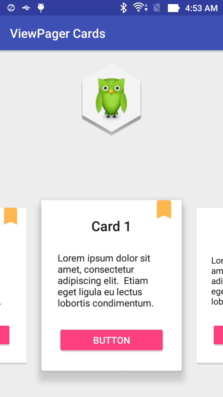
    Doulingo is one of the best application in Android platform, one of features that made it successful is it's UI: beautiful and easy to use. If you have installed this app in your Android device, you will notice that it has an exciting "sliding cards" in the "course screen". This UI look like this:


    As view of an Android programmer, we noticed that it was made by using ViewPager and set each page is a CardView. Today, with this post, I will present the way to create this exciting UI.
    Because of using CardView, a widget of Design Support Library, you must add it's dependency to app-level build.gradle first:
compile 'com.android.support:cardview-v7:24.2.0'
compile 'com.android.support:design:24.2.0'

Designing Layout

Normally, you only need a ViewPager in your activity layout:
activity_main.xml
<?xml version="1.0" encoding="utf-8"?>
<android.support.design.widget.CoordinatorLayout xmlns:android="http://schemas.android.com/apk/res/android"
    android:layout_width="match_parent"
    android:layout_height="match_parent"
    android:fitsSystemWindows="true">

    <ImageView
        android:layout_width="wrap_content"
        android:layout_height="wrap_content"
        android:layout_gravity="top|center"
        android:layout_marginTop="@dimen/activity_horizontal_margin"
        android:src="@drawable/duolingo" />

    <android.support.v4.view.ViewPager
        android:id="@+id/viewPager"
        android:layout_width="match_parent"
        android:layout_height="330dp"
        android:layout_gravity="bottom"
        android:clipToPadding="false"
        android:overScrollMode="never"
        android:paddingBottom="30dp"
        android:paddingEnd="@dimen/card_padding"
        android:paddingLeft="@dimen/card_padding"
        android:paddingRight="@dimen/card_padding"
        android:paddingStart="@dimen/card_padding" />

</android.support.design.widget.CoordinatorLayout>
    The most important thing here is the attribute clipToPadding in the ViewPager. When this is false, the ViewPager won’t cut off the views that we want to show partially and the current item will still be centered.
    By changing card_padding value in your dimensions resource, you’ll also be modifying the view width. In this sample, I used 60dp to get a result similar to Duolingo.
    Each ViewPager's page is a CardView, so it's layout maybe like this:
item_viewpager.xml
<?xml version="1.0" encoding="utf-8"?>
<android.support.v7.widget.CardView xmlns:android="http://schemas.android.com/apk/res/android"
    xmlns:app="http://schemas.android.com/apk/res-auto"
    android:id="@+id/cardView"
    app:cardUseCompatPadding="true"
    android:layout_width="match_parent"
    android:layout_height="wrap_content"
    android:layout_gravity="center">

    <FrameLayout
        android:layout_width="match_parent"
        android:layout_height="wrap_content">


        <LinearLayout
            android:layout_width="match_parent"
            android:layout_height="wrap_content"
            android:gravity="center"
            android:orientation="vertical"
            android:padding="24dp">

            <TextView
                android:id="@+id/title"
                style="@style/TextAppearance.AppCompat.Title"
                android:layout_width="wrap_content"
                android:layout_height="wrap_content"
                android:text="Card title" />

            <TextView
                style="@style/TextAppearance.AppCompat.Body1"
                android:layout_width="wrap_content"
                android:layout_height="wrap_content"
                android:layout_marginTop="24dp"
                android:text="@string/lorem_ipsum" />

            <Button
                style="@style/ButtonStyle"
                android:id="@+id/button"
                android:layout_width="match_parent"
                android:layout_height="wrap_content"
                android:layout_marginTop="24dp"
                android:text="Button" />
        </LinearLayout>

        <ImageView
            android:layout_width="wrap_content"
            android:layout_height="wrap_content"
            android:layout_gravity="top|end"
            android:layout_marginEnd="8dp"
            android:layout_marginRight="8dp"
            android:layout_marginTop="-5dp"
            android:src="@drawable/ic_bookmark_24dp" />

    </FrameLayout>

</android.support.v7.widget.CardView>
    With this setup, we should have already 3 items visible, 1 one of them centered and 2 of them partially visible. Now we just need to animate the elevation of the cards.

Card View shadow and enlarge the center item

    In order to make your UI better like Duolingo, there are 2 works must be done: creating each item shadow and enlarge current ViewPager's item size(at center of screen).
    Let's created a seperated class named ShadowTransformer that implements OnPageChangeListener and PageTransformer interfaces. When the user scrolls to the next card, it should get higher and the previous card should get lower.
    This is done by using the method setCardElevation() of the CardView with an appropriate factor that depends on the scroll offset. In this sample, the CardView base elevation is the default (2dp) and the card will elevate up to 16dp.
    Source code of this class:
ShadowTransformer.java
package info.devexchanges.viewpagercards;

import android.support.v4.view.ViewPager;
import android.support.v7.widget.CardView;
import android.view.View;

public class ShadowTransformer implements ViewPager.OnPageChangeListener, ViewPager.PageTransformer {

    private ViewPager viewPager;
    private CardAdapter cardAdapter;
    private float lastOffset;
    private boolean scalingEnabled;

    public ShadowTransformer(ViewPager viewPager, CardAdapter adapter) {
        this.viewPager = viewPager;
        viewPager.addOnPageChangeListener(this);
        cardAdapter = adapter;
    }

    public void enableScaling(boolean enable) {
        if (scalingEnabled && !enable) {
            // shrink main card
            CardView currentCard = cardAdapter.getCardViewAt(viewPager.getCurrentItem());
            if (currentCard != null) {
                currentCard.animate().scaleY(1);
                currentCard.animate().scaleX(1);
            }
        }else if(!scalingEnabled && enable){
            // grow main card
            CardView currentCard = cardAdapter.getCardViewAt(viewPager.getCurrentItem());
            if (currentCard != null) {
                //enlarge the current item
                currentCard.animate().scaleY(1.1f);
                currentCard.animate().scaleX(1.1f);
            }
        }
        scalingEnabled = enable;
    }

    @Override
    public void transformPage(View page, float position) {

    }

    @Override
    public void onPageScrolled(int position, float positionOffset, int positionOffsetPixels) {
        int realCurrentPosition;
        int nextPosition;
        float baseElevation = cardAdapter.getBaseElevation();
        float realOffset;
        boolean goingLeft = lastOffset > positionOffset;

        // If we're going backwards, onPageScrolled receives the last position
        // instead of the current one
        if (goingLeft) {
            realCurrentPosition = position + 1;
            nextPosition = position;
            realOffset = 1 - positionOffset;
        } else {
            nextPosition = position + 1;
            realCurrentPosition = position;
            realOffset = positionOffset;
        }

        // Avoid crash on overscroll
        if (nextPosition > cardAdapter.getCount() - 1
                || realCurrentPosition > cardAdapter.getCount() - 1) {
            return;
        }

        CardView currentCard = cardAdapter.getCardViewAt(realCurrentPosition);

        // This might be null if a fragment is being used
        // and the views weren't created yet
        if (currentCard != null) {
            if (scalingEnabled) {
                currentCard.setScaleX((float) (1 + 0.1 * (1 - realOffset)));
                currentCard.setScaleY((float) (1 + 0.1 * (1 - realOffset)));
            }
            currentCard.setCardElevation((baseElevation + baseElevation
                    * (CardAdapter.MAX_ELEVATION_FACTOR - 1) * (1 - realOffset)));
        }

        CardView nextCard = cardAdapter.getCardViewAt(nextPosition);

        // We might be scrolling fast enough so that the next (or previous) card
        // was already destroyed or a fragment might not have been created yet
        if (nextCard != null) {
            if (scalingEnabled) {
                nextCard.setScaleX((float) (1 + 0.1 * (realOffset)));
                nextCard.setScaleY((float) (1 + 0.1 * (realOffset)));
            }
            nextCard.setCardElevation((baseElevation + baseElevation
                    * (CardAdapter.MAX_ELEVATION_FACTOR - 1) * (realOffset)));
        }

        lastOffset = positionOffset;
    }

    @Override
    public void onPageSelected(int position) {

    }

    @Override
    public void onPageScrollStateChanged(int state) {

    }
}
    In the main activity, the most important work is create a ShadowTransformer instance and attach it to ViewPager:
MainActivity.java
package info.devexchanges.viewpagercards;

import android.content.Context;
import android.os.Bundle;
import android.support.v4.view.ViewPager;
import android.support.v7.app.AppCompatActivity;

public class MainActivity extends AppCompatActivity {

    @Override
    protected void onCreate(Bundle savedInstanceState) {
        super.onCreate(savedInstanceState);
        setContentView(R.layout.activity_main);
        ViewPager viewPager = (ViewPager) findViewById(R.id.viewPager);

        CardFragmentPagerAdapter pagerAdapter = new CardFragmentPagerAdapter(getSupportFragmentManager(), dpToPixels(2, this));
        ShadowTransformer fragmentCardShadowTransformer = new ShadowTransformer(viewPager, pagerAdapter);
        fragmentCardShadowTransformer.enableScaling(true);

        viewPager.setAdapter(pagerAdapter);
        viewPager.setPageTransformer(false, fragmentCardShadowTransformer);
        viewPager.setOffscreenPageLimit(3);
    }

    /**
     * Change value in dp to pixels
     * @param dp
     * @param context
     */
    public static float dpToPixels(int dp, Context context) {
        return dp * (context.getResources().getDisplayMetrics().density);
    }
}
Running this activity, we'll have this output:

Conclusions

    Looks pretty cool, right? Now we have completed making the interesting UI like Duolingo team did through handling ViewPager scrolling event. Hope this can help you to build one more exciting UI. There are some reference links you should read to get deep understanding about ViewPager (the official widget to build screen slides in Android):

Carousel Layout with ViewPager in Android

Carousel Layout with ViewPager in Android

    In my previous post, by using an external library called CoverFlow, I had presented the way to make a carousel layout in Android application. According to readers feedbacks, I realize that this library is not behaving well. So, through this post, I will provide an another way to make this layout by using ViewPager. It will not have a well interface but working better.

Creating a custom view

    Firstly, I create a custom view for each carousel item as a subclass of LinearLayout and overriding onDraw() to customizing scale animation:
CarouselLinearLayout.java
package info.devexchanges.carousellayout;

import android.content.Context;
import android.graphics.Canvas;
import android.util.AttributeSet;
import android.util.Log;
import android.widget.LinearLayout;

public class CarouselLinearLayout extends LinearLayout {
    private float scale = CarouselPagerAdapter.BIG_SCALE;

    public CarouselLinearLayout(Context context, AttributeSet attrs) {
        super(context, attrs);
    }

    public CarouselLinearLayout(Context context) {
        super(context);
    }

    public void setScaleBoth(float scale) {
        this.scale = scale;
        this.invalidate();
    }

    @Override
    protected void onDraw(Canvas canvas) {
        super.onDraw(canvas);

        // The main mechanism to display scale animation, you can customize it as your needs
        int w = this.getWidth();
        int h = this.getHeight();
        canvas.scale(scale, scale, w/2, h/2);
    }
}
Important Note: You can custom from other ViewGroup like RelativeLayout, FrameLayout,... based on your purpose.  
    Each carousel item is a Fragment, so it's layout must be a CarouselLinearLayout as root like this:
fragment_image.xml
<?xml version="1.0" encoding="utf-8"?>
<info.devexchanges.carousellayout.CarouselLinearLayout xmlns:android="http://schemas.android.com/apk/res/android"
    android:id="@+id/root_container"
    android:layout_width="match_parent"
    android:layout_height="match_parent"
    android:background="@android:color/transparent"
    android:gravity="center"
    android:orientation="vertical">

    <ImageView
        android:id="@+id/pagerImg"
        android:layout_width="match_parent"
        android:layout_height="match_parent"
        android:scaleType="fitXY"
        android:contentDescription="@string/app_name"
        android:src="@drawable/image1" />

    <TextView
        android:id="@+id/text"
        android:layout_width="wrap_content"
        android:layout_height="wrap_content" />
</info.devexchanges.carousellayout.CarouselLinearLayout>
    And in the programmatically code, scaling them to center of device screen by calculating the width and height:
ItemFragment.java
package info.devexchanges.carousellayout;

import android.annotation.SuppressLint;
import android.content.Intent;
import android.os.Bundle;
import android.support.annotation.Nullable;
import android.support.v4.app.Fragment;
import android.util.DisplayMetrics;
import android.view.LayoutInflater;
import android.view.View;
import android.view.ViewGroup;
import android.widget.ImageView;
import android.widget.LinearLayout;
import android.widget.TextView;

public class ItemFragment extends Fragment {

    private static final String POSITON = "position";
    private static final String SCALE = "scale";
    private static final String DRAWABLE_RESOURE = "resource";

    private int screenWidth;
    private int screenHeight;

    private int[] imageArray = new int[]{R.drawable.image1, R.drawable.image2,
            R.drawable.image3, R.drawable.image4, R.drawable.image5,
            R.drawable.image6, R.drawable.image7, R.drawable.image8,
            R.drawable.image9, R.drawable.image10};

    public static Fragment newInstance(MainActivity context, int pos, float scale) {
        Bundle b = new Bundle();
        b.putInt(POSITON, pos);
        b.putFloat(SCALE, scale);

        return Fragment.instantiate(context, ItemFragment.class.getName(), b);
    }

    @Override
    public void onCreate(@Nullable Bundle savedInstanceState) {
        super.onCreate(savedInstanceState);
        getWidthAndHeight();
    }

    @SuppressLint("SetTextI18n")
    @Override
    public View onCreateView(LayoutInflater inflater, ViewGroup container, Bundle savedInstanceState) {
        if (container == null) {
            return null;
        }

        final int postion = this.getArguments().getInt(POSITON);
        float scale = this.getArguments().getFloat(SCALE);

        LinearLayout.LayoutParams layoutParams = new LinearLayout.LayoutParams(screenWidth / 2, screenHeight / 2);
        LinearLayout linearLayout = (LinearLayout) inflater.inflate(R.layout.fragment_image, container, false);

        TextView textView = (TextView) linearLayout.findViewById(R.id.text);
        CarouselLinearLayout root = (CarouselLinearLayout) linearLayout.findViewById(R.id.root_container);
        ImageView imageView = (ImageView) linearLayout.findViewById(R.id.pagerImg);

        textView.setText("Carousel item: " + postion);
        imageView.setLayoutParams(layoutParams);
        imageView.setImageResource(imageArray[postion]);

        //handling click event
        imageView.setOnClickListener(new View.OnClickListener() {
            @Override
            public void onClick(View v) {
                Intent intent = new Intent(getActivity(), ImageDetailsActivity.class);
                intent.putExtra(DRAWABLE_RESOURE, imageArray[postion]);
                startActivity(intent);
            }
        });

        root.setScaleBoth(scale);

        return linearLayout;
    }

    /**
     * Get device screen width and height
     */
    private void getWidthAndHeight() {
        DisplayMetrics displaymetrics = new DisplayMetrics();
        getActivity().getWindowManager().getDefaultDisplay().getMetrics(displaymetrics);
        screenHeight = displaymetrics.heightPixels;
        screenWidth = displaymetrics.widthPixels;
    }
}

Customizing ViewPager adapter

    The most important work is building the ViewPager adapter, it's must implement OnPageChangeListener interface and in onPageScrolled() method (called when user scroll to change the "center item"), we must scaling current/next/back items size:
CarouselPagerAdapter.java
package info.devexchanges.carousellayout;

import android.support.v4.app.Fragment;
import android.support.v4.app.FragmentManager;
import android.support.v4.app.FragmentPagerAdapter;
import android.support.v4.view.ViewPager;

public class CarouselPagerAdapter extends FragmentPagerAdapter implements ViewPager.OnPageChangeListener {

    public final static float BIG_SCALE = 1.0f;
    public final static float SMALL_SCALE = 0.7f;
    public final static float DIFF_SCALE = BIG_SCALE - SMALL_SCALE;
    private MainActivity context;
    private FragmentManager fragmentManager;
    private float scale;

    public CarouselPagerAdapter(MainActivity context, FragmentManager fm) {
        super(fm);
        this.fragmentManager = fm;
        this.context = context;
    }

    @Override
    public Fragment getItem(int position) {
        // make the first pager bigger than others
        try {
            if (position == MainActivity.FIRST_PAGE)
                scale = BIG_SCALE;
            else
                scale = SMALL_SCALE;

            position = position % MainActivity.count;

        } catch (Exception e) {
            e.printStackTrace();
        }
        return ItemFragment.newInstance(context, position, scale);
    }

    @Override
    public int getCount() {
        int count = 0;
        try {
            count = MainActivity.count * MainActivity.LOOPS;
        } catch (Exception e) {
            // TODO: handle exception
            e.printStackTrace();
        }
        return count;
    }

    @Override
    public void onPageScrolled(int position, float positionOffset, int positionOffsetPixels) {
        try {
            if (positionOffset >= 0f && positionOffset <= 1f) {
                CarouselLinearLayout cur = getRootView(position);
                CarouselLinearLayout next = getRootView(position + 1);

                cur.setScaleBoth(BIG_SCALE - DIFF_SCALE * positionOffset);
                next.setScaleBoth(SMALL_SCALE + DIFF_SCALE * positionOffset);
            }
        } catch (Exception e) {
            e.printStackTrace();
        }
    }

    @Override
    public void onPageSelected(int position) {

    }

    @Override
    public void onPageScrollStateChanged(int state) {

    }

    @SuppressWarnings("ConstantConditions")
    private CarouselLinearLayout getRootView(int position) {
        return (CarouselLinearLayout) fragmentManager.findFragmentByTag(this.getFragmentTag(position))
                .getView().findViewById(R.id.root_container);
    }

    private String getFragmentTag(int position) {
        return "android:switcher:" + context.pager.getId() + ":" + position;
    }
}

Usage in Activity

    Declaring a simple layout for the main activity, which contains a ViewPager object:
activity_main.xml
<?xml version="1.0" encoding="utf-8"?>
<LinearLayout xmlns:android="http://schemas.android.com/apk/res/android"
    xmlns:tools="http://schemas.android.com/tools"
    android:id="@+id/activity_main_layout"
    android:layout_width="match_parent"
    android:layout_height="match_parent"
    android:orientation="vertical"
    tools:context=".MainActivity" >

    <android.support.v4.view.ViewPager
        android:id="@+id/myviewpager"
        android:layout_width="match_parent"
        android:layout_height="match_parent"
        android:layout_gravity="center" />

</LinearLayout>
    The most important work in the activity programmatically code is set margin between pages, I will pull them closer together to make a better interface:
MainActivity.java
package info.devexchanges.carousellayout;

import android.os.Bundle;
import android.support.v4.view.ViewPager;
import android.support.v7.app.AppCompatActivity;
import android.util.DisplayMetrics;

public class MainActivity extends AppCompatActivity {
    public final static int LOOPS = 1000;
    public CarouselPagerAdapter adapter;
    public ViewPager pager;
    public static int count = 10; //ViewPager items size
    /**
     * You shouldn't define first page = 0.
     * Let define firstpage = 'number viewpager size' to make endless carousel
     */
    public static int FIRST_PAGE = 10;

    @Override
    public void onCreate(Bundle savedInstanceState) {
        super.onCreate(savedInstanceState);

        setContentView(R.layout.activity_main);

        pager = (ViewPager) findViewById(R.id.myviewpager);

        //set page margin between pages for viewpager
        DisplayMetrics metrics = new DisplayMetrics();
        getWindowManager().getDefaultDisplay().getMetrics(metrics);
        int pageMargin = ((metrics.widthPixels / 4) * 2);
        pager.setPageMargin(-pageMargin);

        adapter = new CarouselPagerAdapter(this, getSupportFragmentManager());
        pager.setAdapter(adapter);
        adapter.notifyDataSetChanged();

        pager.addOnPageChangeListener(adapter);

        // Set current item to the middle page so we can fling to both
        // directions left and right
        pager.setCurrentItem(FIRST_PAGE);
        pager.setOffscreenPageLimit(3);
    }
}
    At the last, by handling click event for each carousel item (you can see this code in ItemFragment, we provide a destination activity to display the image which selected:
ImageDetailsActivity.java

package info.devexchanges.carousellayout;

import android.os.Bundle;
import android.support.annotation.Nullable;
import android.support.v7.app.AppCompatActivity;
import android.view.View;
import android.widget.Button;
import android.widget.ImageView;

public class ImageDetailsActivity extends AppCompatActivity {

    private ImageView imageView;
    private Button button;
    private static final String DRAWABLE_RESOURE = "resource";

    @Override
    protected void onCreate(@Nullable Bundle savedInstanceState) {
        super.onCreate(savedInstanceState);

        setContentView(R.layout.activity_full_image);

        imageView = (ImageView)findViewById(R.id.img);
        button = (Button)findViewById(R.id.btnClose);

        int drawbleResource = getIntent().getIntExtra(DRAWABLE_RESOURE, 0);
        imageView.setImageResource(drawbleResource);

        button.setOnClickListener(new View.OnClickListener() {
            @Override
            public void onClick(View v) {
                finish();
            }
        });
    }

    @Override
    public void onBackPressed() {
        finish();
    }
}
    And this is the destination activity layout:
activity_full_image.xml
<?xml version="1.0" encoding="utf-8"?>
<RelativeLayout xmlns:android="http://schemas.android.com/apk/res/android"
    android:layout_width="match_parent"
    android:layout_height="match_parent" >

    <ImageView
        android:id="@+id/img"
        android:layout_width="match_parent"
        android:layout_height="match_parent"
        android:scaleType="fitCenter" />

    <Button
        android:id="@+id/btnClose"
        android:padding="5dp"
        android:layout_width="wrap_content"
        android:layout_height="30dp"
        android:layout_alignParentRight="true"
        android:layout_alignParentTop="true"
        android:layout_marginRight="@dimen/activity_horizontal_margin"
        android:layout_marginTop="15dp"
        android:text="Close" />

</RelativeLayout>
    There are AndroidManifest.xml and styles resource:
AndroidManifest.xml
<?xml version="1.0" encoding="utf-8"?>
<manifest xmlns:android="http://schemas.android.com/apk/res/android"
    package="info.devexchanges.carousellayout">

    <application
        android:allowBackup="true"
        android:icon="@mipmap/ic_launcher"
        android:label="@string/app_name"
        android:supportsRtl="true"
        android:theme="@style/AppTheme">
        <activity android:name=".MainActivity">
            <intent-filter>
                <action android:name="android.intent.action.MAIN" />

                <category android:name="android.intent.category.LAUNCHER" />
            </intent-filter>
        </activity>
        <activity android:name=".ImageDetailsActivity"
            android:theme="@style/Theme.AppCompat.Light.NoActionBar.FullScreen"/>
    </application>

</manifest>
styles.xml
<resources>

    <style name="AppTheme" parent="Theme.AppCompat.Light.DarkActionBar">
        <!-- Customize your theme here. -->
        <item name="colorPrimary">@color/colorPrimary</item>
        <item name="colorPrimaryDark">@color/colorPrimaryDark</item>
        <item name="colorAccent">@color/colorAccent</item>
    </style>

    <style name="Theme.AppCompat.Light.NoActionBar.FullScreen" parent="@style/Theme.AppCompat.Light">
        <item name="windowNoTitle">true</item>
        <item name="windowActionBar">false</item>
        <item name="android:windowFullscreen">true</item>
        <item name="android:windowContentOverlay">@null</item>
    </style>

</resources>

Final thoughts

    Running application, we have this output in portrait mode:
    And in the landscape mode:

    As you can see, by ViewPager widget, you can make a carousel layout easily. Although it not have a good interface (items are quite far with others) but it's is the official way to deal with this problem, hope it's helpful with your work. Finally, you can view my project on @Github.

Material Design TabLayout and Toolbar animation (show/hide) when scrolling screen

Material Design TabLayout and Toolbar animation (show/hide) when scrolling screen

    In previous post, I have presented the expanding/collapsing animations with Toolbar when scrolling the screen (the screen's content is RecyclerView or NestedScrollView). Today, I will talk about a popular layout: Tab bar. With TabLayout of Design Support Library, you can make a swipe view with tab easily. Now, by this post, I present  how to hiding/showing it and Toolbar (work as Action Bar) when your content can be scrolled.

Prerequisites

    Firstly, in order to use these widget, adding Design Support Library dependency into your module build.gradle:
compile 'com.android.support:design:23.4.0'
Make sure that you use a "no Action Bar theme" for your project:
styles.xml
<resources>

    <style name="AppTheme" parent="Theme.AppCompat.Light.NoActionBar">
        <item name="colorPrimary">@color/colorPrimary</item>
        <item name="colorPrimaryDark">@color/colorPrimaryDark</item>
        <item name="colorAccent">@color/colorAccent</item>
    </style>

    <style name="MyCustomTabLayout" parent="Widget.Design.TabLayout">
        <item name="tabTextAppearance">@style/MyCustomTabText</item>
        <item name="tabBackground">@drawable/tab_layout</item>
        <item name="tabSelectedTextColor">#ff0000</item>
    </style>

    <style name="MyCustomTabText" parent="TextAppearance.AppCompat.Button">
        <item name="android:textSize">13sp</item>
        <item name="android:textAllCaps">false</item>
        <item name="android:textColor">@android:color/holo_blue_dark</item>
    </style>

</resources>
    I will use MyCustomTabLayout for styling the TabLayout then.

Hide TabLayout and Toolbar when scroll

    Now, follow these steps in designing layout (xml file), we will set both TabLayout and Toolbar are hidden when user scroll screen:
  • Make CoordinatorLayout as the root view.
  • Wrapping Toolbar and TabLayout in AppBarLayout.
  • Adding app:layout_scrollFlags="scroll|enterAlways" attribute to Toolbar and TabLayout.
  • Adding  app:layout_behavior="@string/appbar_scrolling_view_behavior" to ViewPager. This attribute will trigger event in the Toolbar.
    And we have the activity layout like this:
activity_main.xml
<android.support.design.widget.CoordinatorLayout xmlns:android="http://schemas.android.com/apk/res/android"
    xmlns:app="http://schemas.android.com/apk/res-auto"
    android:layout_width="match_parent"
    android:layout_height="wrap_content">

    <android.support.design.widget.AppBarLayout
        android:layout_width="match_parent"
        android:layout_height="wrap_content"
        android:theme="@style/ThemeOverlay.AppCompat.Dark">

        <android.support.v7.widget.Toolbar
            android:id="@+id/toolbar"
            android:layout_width="match_parent"
            android:layout_height="?attr/actionBarSize"
            app:layout_scrollFlags="scroll|enterAlways" />

        <android.support.design.widget.TabLayout
            android:id="@+id/tab_layout"
            android:layout_width="match_parent"
            android:layout_height="wrap_content"
            android:background="@color/colorPrimary"
            app:layout_scrollFlags="scroll|enterAlways" />
    </android.support.design.widget.AppBarLayout>

    <android.support.v4.view.ViewPager
        android:id="@+id/view_pager"
        android:layout_width="match_parent"
        android:layout_height="match_parent"
        app:layout_behavior="@string/appbar_scrolling_view_behavior" />
</android.support.design.widget.CoordinatorLayout>
    In programmatically code, we'll populating tabs and do another necessary works. This is activity full source:
MainActivity.java
package info.devexchanges.tablayout;

import android.os.Bundle;
import android.support.design.widget.TabLayout;
import android.support.v4.app.Fragment;
import android.support.v4.app.FragmentManager;
import android.support.v4.app.FragmentPagerAdapter;
import android.support.v4.view.ViewPager;
import android.support.v7.app.AppCompatActivity;
import android.support.v7.widget.Toolbar;
import android.view.View;

public class MainActivity extends AppCompatActivity {

    private Toolbar toolbar;
    private TabLayout tabLayout;
    private ViewPager viewPager;

    private void findViews() {
        toolbar = (Toolbar) findViewById(R.id.toolbar);
        tabLayout = (TabLayout) findViewById(R.id.tab_layout);
        viewPager = (ViewPager) findViewById(R.id.view_pager);
    }

    @Override
    protected void onCreate(Bundle savedInstanceState) {
        super.onCreate(savedInstanceState);
        setContentView(R.layout.activity_tab);
        findViews();
        setSupportActionBar(toolbar);

        //create and set ViewPager adapter
        ViewPagerAdapter adapter = new ViewPagerAdapter(getSupportFragmentManager());
        viewPager.setAdapter(adapter);

        //create tabs title
        tabLayout.addTab(tabLayout.newTab().setText("Fragment 1"));
        tabLayout.addTab(tabLayout.newTab().setText("Fragment 2"));

        //attach tab layout with ViewPager
        //set gravity for tab bar
        tabLayout.setTabGravity(TabLayout.GRAVITY_FILL);
        tabLayout.setTabMode(TabLayout.MODE_FIXED);

        //change selected tab when viewpager changed page
        viewPager.addOnPageChangeListener(new TabLayout.TabLayoutOnPageChangeListener(tabLayout));

        //change viewpager page when tab selected
        tabLayout.setOnTabSelectedListener(new TabLayout.OnTabSelectedListener() {
            @Override
            public void onTabSelected(TabLayout.Tab tab) {
                viewPager.setCurrentItem(tab.getPosition());
            }

            @Override
            public void onTabUnselected(TabLayout.Tab tab) {

            }

            @Override
            public void onTabReselected(TabLayout.Tab tab) {

            }
        });
    }

    private class ViewPagerAdapter extends FragmentPagerAdapter {

        public ViewPagerAdapter(FragmentManager fm) {
            super(fm);
        }

        @Override
        public Fragment getItem(int position) {
            return new ContentFragment();
        }

        @Override
        public int getCount() {
            return 2;
        }
    }
}
    And code for each Fragment:
ContentFragment.java
package info.devexchanges.tablayout;

import android.os.Bundle;
import android.support.annotation.Nullable;
import android.support.v4.app.Fragment;
import android.view.LayoutInflater;
import android.view.View;
import android.view.ViewGroup;

public class ContentFragment extends Fragment {

    @Nullable
    @Override
    public View onCreateView(LayoutInflater inflater, @Nullable ViewGroup container, @Nullable Bundle savedInstanceState) {
        return inflater.inflate(R.layout.fragment_content, container, false);
    }

    @Override
    public void onViewCreated(View view, @Nullable Bundle savedInstanceState) {
        super.onViewCreated(view, savedInstanceState);
    }
}
The Fragment's layout:
fragment_conent.xml
<?xml version="1.0" encoding="utf-8"?>
<android.support.v4.widget.NestedScrollView xmlns:android="http://schemas.android.com/apk/res/android"
    android:layout_width="match_parent"
    android:layout_height="match_parent">

    <TextView
        android:id="@+id/text"
        android:layout_width="match_parent"
        android:layout_height="wrap_content"
        android:padding="@dimen/activity_horizontal_margin"
        android:text="@string/lorem_ipsum" />

</android.support.v4.widget.NestedScrollView>
    Running app, we have this output:

Hide Toolbar and keep TabLayout

    Removing app:layout_scrollFlags attribute from TabLayout, we'll done this requirement:

Hide TabLayout and keep Toolbar when scroll

    This requirement is a bit more difficult. We should wrap TabLayout in CollapsingToolbarLayout, putting Toolbar and TabLayout in to 2 separated AppBarLayouts:
activity_main.xml
<RelativeLayout xmlns:android="http://schemas.android.com/apk/res/android"
    xmlns:app="http://schemas.android.com/apk/res-auto"
    android:layout_width="match_parent"
    android:layout_height="match_parent">

    <android.support.design.widget.AppBarLayout
        android:id="@+id/id_toolbar_container"
        android:layout_width="match_parent"
        android:layout_height="wrap_content"
        android:fitsSystemWindows="true"
        android:theme="@style/ThemeOverlay.AppCompat.Dark">

        <android.support.v7.widget.Toolbar
            android:id="@+id/toolbar"
            android:layout_width="match_parent"
            android:layout_height="?attr/actionBarSize"
            app:layout_collapseMode="pin"
            app:layout_scrollFlags="scroll|exitUntilCollapsed" />
    </android.support.design.widget.AppBarLayout>

    <android.support.design.widget.CoordinatorLayout
        android:id="@+id/main_content"
        android:layout_width="match_parent"
        android:layout_height="match_parent"
        android:layout_below="@id/id_toolbar_container">

        <android.support.design.widget.AppBarLayout
            android:id="@+id/app_bar"
            android:layout_width="match_parent"
            android:layout_height="wrap_content"
            android:theme="@style/ThemeOverlay.AppCompat.Dark">

            <android.support.design.widget.CollapsingToolbarLayout
                android:layout_width="match_parent"
                android:layout_height="wrap_content"
                app:layout_scrollFlags="scroll|enterAlways">

                <android.support.design.widget.TabLayout
                    android:id="@+id/tab_layout"
                    android:layout_width="match_parent"
                    android:layout_height="?attr/actionBarSize" />
            </android.support.design.widget.CollapsingToolbarLayout>

        </android.support.design.widget.AppBarLayout>

        <android.support.v4.view.ViewPager
            android:id="@+id/view_pager"
            android:layout_width="match_parent"
            android:layout_height="match_parent"
            app:layout_behavior="@string/appbar_scrolling_view_behavior" />

    </android.support.design.widget.CoordinatorLayout>
</RelativeLayout>
And this is output:

Conclusions

    In this tip, I've present some options for Toolbar and TabLayout. This is often called scrolling techniques of Material Design (please read my previous post to know more). From this, I hope that readers can choose a suitable scrolling style with your Action Bar and Tab bar in your own application. Finally, thanks for reading!

Crumbling Layout in Android using external library

    The official widget to make swipe view in Android is ViewPager. To making it more attractive, we should provide transition animation when swiping - sliding between UI screens. In the previous post, with JazzyViewPager, you can make a lot of exciting effect with the container layout but, what about making an effect with content in the ViewPager?
    Now, in this post, with Bitutorial library, we will make the "crumbling effect" for ViewPager content when user swipe to change page!
    DEMO VIDEO:


Import and use library

    Adding this dependency to your app/build.gradle to use this library:
dependencies {
        compile 'com.cleveroad:splittransformation:0.9.0'
    }
   Then, when coding, you have to wrap your pager adapter with TransformationAdapterWrapper:
TransformationAdapterWrapper wrapper = TransformationAdapterWrapper
        .wrap(getContext(), adapter)
        .rows(...)
        .columns(...)
        .piecesSpacing(...)
        .translationX(...)
        .translationY(...)
        .marginTop(...)
        .bitmapScale(...)
        .complexViewDetector(...)
        .bitmapTransformerFactory(...)
        .build();

Sample project

    Creating a layout for project's main activity, containing a ViewPager object and a SquareViewPagerIndicator (also including in Bitutorial library) to make view indicator:
activity_main.xml
<?xml version="1.0" encoding="utf-8"?>
<RelativeLayout xmlns:android="http://schemas.android.com/apk/res/android"
    xmlns:app="http://schemas.android.com/apk/res-auto"
    android:layout_width="match_parent"
    android:layout_height="match_parent"
    android:background="#fddc9b"
    android:padding="@dimen/activity_horizontal_margin">

    <TextView
        android:layout_width="match_parent"
        android:layout_height="wrap_content"
        android:layout_centerHorizontal="true"
        android:gravity="center"
        android:text="Mobile OS"
        android:textStyle="bold" />

    <android.support.v4.view.ViewPager
        android:id="@+id/pager"
        android:layout_width="match_parent"
        android:layout_height="match_parent" />

    <com.cleveroad.splittransformation.SquareViewPagerIndicator
        android:id="@+id/indicator"
        android:layout_width="match_parent"
        android:layout_height="wrap_content"
        android:layout_alignParentBottom="true"
        android:layout_marginTop="@dimen/activity_horizontal_margin"
        app:trans_debugItemsCount="4" />

</RelativeLayout>
Programmatically coding, including a simple ViewPager adapter (based on PagerAdapter) here:
MainActivity.java
package info.devexchanges.crumblinglayout;

import android.support.v4.app.Fragment;
import android.support.v4.app.FragmentManager;
import android.support.v4.app.FragmentStatePagerAdapter;
import android.support.v4.view.ViewPager;
import android.support.v7.app.AppCompatActivity;
import android.os.Bundle;

import com.cleveroad.splittransformation.SquareViewPagerIndicator;
import com.cleveroad.splittransformation.TransformationAdapterWrapper;

public class MainActivity extends AppCompatActivity {

    private ViewPager viewPager;
    private SquareViewPagerIndicator indicator;

    @Override
    protected void onCreate(Bundle savedInstanceState) {
        super.onCreate(savedInstanceState);
        setContentView(R.layout.activity_main);

        viewPager = (ViewPager) findViewById(R.id.pager);
        indicator = (SquareViewPagerIndicator) findViewById(R.id.indicator);

        //Initializing an adapter and wrap it to TransformationAdapterWrapper
        SimplePagerAdapter adapter = new SimplePagerAdapter(getSupportFragmentManager());
        TransformationAdapterWrapper wrapper = TransformationAdapterWrapper
                .wrap(this, adapter) //wrap existing page adapter
                .rows(10) //number of rows to split image.
                .columns(7) // number of columns to split image
                .marginTop(getResources().getDimensionPixelSize(R.dimen.activity_horizontal_margin))
                .build(); //initializing

        viewPager.setAdapter(wrapper);
        viewPager.setPageTransformer(false, wrapper); //never forget this important line!
        indicator.initializeWith(viewPager); //attaching indicator with ViewPager
    }

    private static class SimplePagerAdapter extends FragmentStatePagerAdapter {

        public SimplePagerAdapter(FragmentManager fm) {
            super(fm);
        }

        @Override
        public Fragment getItem(int position) {
            return ViewPagerFragment.getInstances(position);
        }

        @Override
        public int getCount() {
            return 7;
        }
    }
}
    The Fragments code, (ViewPager's page content):
ViewPagerFragment.java
package info.devexchanges.crumblinglayout;

import android.os.Bundle;
import android.support.annotation.Nullable;
import android.support.v4.app.Fragment;
import android.view.LayoutInflater;
import android.view.View;
import android.view.ViewGroup;
import android.widget.ImageView;
import android.widget.TextView;

public class ViewPagerFragment extends Fragment {

    private ImageView imageView;
    private TextView textView;
    private static String[] phoneTypes = {"Android", "iOS", "WindowsPhone", "BlackBerry", "Tizen", "Ubuntu phone", "Sailfish"};
    private static int[] drawables = {R.drawable.android, R.drawable.ios, R.drawable.windows_phone,
            R.drawable.blackberry, R.drawable.tizen, R.drawable.ubuntu, R.drawable.sailfish};

    public static ViewPagerFragment getInstances(int position) {
        ViewPagerFragment fragment = new ViewPagerFragment();
        Bundle args = new Bundle();
        args.putInt("position", position);
        fragment.setArguments(args);

        return fragment;
    }

    @Nullable
    @Override
    public View onCreateView(LayoutInflater inflater, @Nullable ViewGroup container, @Nullable Bundle savedInstanceState) {
        return inflater.inflate(R.layout.fragment_layout, container, false);
    }

    @Override
    public void onViewCreated(View view, @Nullable Bundle savedInstanceState) {
        super.onViewCreated(view, savedInstanceState);

        int position = getArguments().getInt("position");

        imageView = (ImageView) view.findViewById(R.id.image);
        textView = (TextView) view.findViewById(R.id.text_view);

        imageView.setImageResource(drawables[position]);
        textView.setText(phoneTypes[position]);
    }
}
And the Fragment's layout:
fragment_layout.xml
<?xml version="1.0" encoding="utf-8"?>
<RelativeLayout xmlns:android="http://schemas.android.com/apk/res/android"
    android:layout_width="match_parent"
    android:layout_height="match_parent">

    <ImageView
        android:id="@+id/image"
        android:layout_width="250dp"
        android:layout_height="250dp"
        android:layout_centerInParent="true" />

    <TextView
        android:id="@+id/text_view"
        android:layout_width="match_parent"
        android:layout_height="wrap_content"
        android:layout_below="@id/image"
        android:layout_marginTop="@dimen/activity_horizontal_margin"
        android:gravity="center"
        android:text="dsfsdfdsf"
        android:textColor="@android:color/holo_green_dark"
        android:textStyle="bold" />

</RelativeLayout>
    Running application, we have this result:

Creating welcome screen for the first use in Android application

    On the first use an Android application, you usually see the welcome screen. It's the short introduction about that app and moreover, some manual instructions for users. We can swipe to next/back to get information and usually, it has a "SKIP" button to finish this screen immediately.
    DEMO VIDEO:

    With ViewPager, we can make it easily. To make it more attractive, we'll use PageIndicator library for styling the page indicator at the bottom screen. Now, let's start.

Import PageIndicator library

 
    Firstly, you must go to this library Home page and download the lastest version (in zip format) to your computer. Then, extract and import it as a module in your Android project (read this post to find out the way to import non-gradle project as a library in Android Studio).
    Two modules build.gradle file should be like this:
app/build.gradle
apply plugin: 'com.android.application'

android {
    compileSdkVersion 23
    buildToolsVersion "23.0.3"

    defaultConfig {
        applicationId "info.devexchanges.welcomescreen"
        minSdkVersion 14
        targetSdkVersion 23
        versionCode 1
        versionName "1.0"
    }
    buildTypes {
        release {
            minifyEnabled false
            proguardFiles getDefaultProguardFile('proguard-android.txt'), 'proguard-rules.pro'
        }
    }
}

dependencies {
    compile fileTree(include: ['*.jar'], dir: 'libs')
    compile 'com.android.support:appcompat-v7:23.4.0'
    compile project(':library')
}
library/build.gradle
apply plugin: 'com.android.library'

android {
    compileSdkVersion 23
    buildToolsVersion "23.0.3"

    defaultConfig {
        minSdkVersion 14
        targetSdkVersion 23
    }

    buildTypes {
        release {
            minifyEnabled false
            proguardFiles getDefaultProguardFile('proguard-android.txt'), 'proguard-rules.txt'
        }
    }
}

dependencies {
    compile 'com.android.support:appcompat-v7:23.4.0'
}

Coding project

Seem the extra work take us quite lot of time! Now, we declaring the "welcome activity" first. It's layout contains a ViewPager object and CirclePageIndicator to show number of pages:
activity_welcome.xml
<?xml version="1.0" encoding="utf-8"?>
<LinearLayout xmlns:android="http://schemas.android.com/apk/res/android"
    xmlns:app="http://schemas.android.com/apk/res-auto"
    android:layout_width="match_parent"
    android:layout_height="match_parent"
    android:orientation="vertical">

    <android.support.v4.view.ViewPager
        android:id="@+id/pager"
        android:layout_width="match_parent"
        android:layout_height="0dp"
        android:layout_weight="0.9" />

    <RelativeLayout
        android:id="@+id/layout"
        android:layout_width="match_parent"
        android:layout_height="0dp"
        android:layout_weight="0.1"
        android:orientation="horizontal">

        <TextView
            android:id="@+id/skip"
            android:layout_width="wrap_content"
            android:layout_height="wrap_content"
            android:layout_alignParentLeft="true"
            android:layout_marginLeft="@dimen/activity_horizontal_margin"
            android:text="SKIP"
            android:textStyle="bold"
            android:textColor="@android:color/white" />

        <com.viewpagerindicator.CirclePageIndicator
            android:id="@+id/indicator"
            android:layout_width="wrap_content"
            android:layout_height="wrap_content"
            android:layout_centerHorizontal="true"
            android:padding="10dip"
            app:fillColor="@color/colorPrimaryDark"
            app:snap="true" />

        <TextView
            android:id="@+id/done"
            android:layout_width="wrap_content"
            android:layout_height="wrap_content"
            android:layout_alignParentRight="true"
            android:layout_marginRight="@dimen/activity_horizontal_margin"
            android:text="DONE"
            android:textStyle="bold"
            android:textColor="@android:color/white"
            android:visibility="gone" />
    </RelativeLayout>
</LinearLayout>
    Setting adapter (containing Fragments as pages) for ViewPager and handling 2 buttons event (Skip and Done) in programmatically code:
WelcomeActivity.java
package info.devexchanges.welcomescreen;

import android.os.Bundle;
import android.support.v4.view.ViewPager;
import android.support.v7.app.AppCompatActivity;
import android.util.Log;
import android.view.View;

import com.viewpagerindicator.CirclePageIndicator;

public class WelcomeActivity extends AppCompatActivity {

    private ViewPager viewPager;
    private View btnDone;
    private SessionManager session;
    private View skipLayout;
    private static int colors[] = {android.R.color.holo_orange_dark, android.R.color.holo_purple,
            android.R.color.holo_blue_dark, android.R.color.holo_green_dark};

    @Override
    protected void onCreate(Bundle savedInstanceState) {
        super.onCreate(savedInstanceState);

        setContentView(R.layout.activity_welcome);
        session = new SessionManager(getApplicationContext());

        viewPager = (ViewPager) findViewById(R.id.pager);
        CirclePageIndicator pageIndicator = (CirclePageIndicator) findViewById(R.id.indicator);
        btnDone = findViewById(R.id.done);
        skipLayout = findViewById(R.id.layout);
        skipLayout.setBackgroundColor(getResources().getColor(colors[0]));
        final View btnSkip = findViewById(R.id.skip);

        //set viewpager adapter
        ViewPagerAdapter adapter = new ViewPagerAdapter(getSupportFragmentManager());
        viewPager.setAdapter(adapter);

        //set page indicator
        pageIndicator.setViewPager(viewPager);

        //set onpage changed listener
        viewPager.addOnPageChangeListener(new ViewPager.OnPageChangeListener() {
            @Override
            public void onPageScrolled(int position, float positionOffset, int positionOffsetPixels) {
                Log.d("Main", "pos:" + position + "  " + positionOffset + "  " + positionOffsetPixels);
            }

            @Override
            public void onPageSelected(int position) {
                if (position == viewPager.getAdapter().getCount() - 1) {
                    btnDone.setVisibility(View.VISIBLE);
                    btnSkip.setVisibility(View.GONE);
                } else {
                    btnDone.setVisibility(View.GONE);
                    btnSkip.setVisibility(View.VISIBLE);
                }

                skipLayout.setBackgroundColor(getResources().getColor(colors[position]));
            }

            @Override
            public void onPageScrollStateChanged(int state) {

            }
        });

        assert btnSkip != null;
        btnSkip.setOnClickListener(new View.OnClickListener() {
            @Override
            public void onClick(View v) {
                viewPager.setCurrentItem(viewPager.getAdapter().getCount() - 1);
            }
        });

        //close this screen when click "DONE"
        btnDone.setOnClickListener(new View.OnClickListener() {
            @Override
            public void onClick(View v) {
                session.setIsFirst(false);
                finish();
            }
        });
    }

    @Override
    public void onBackPressed() {
        super.onBackPressed();
        session.setIsFirst(false);
    }
}
     And this is main activity, app will launch it when start:
MainActivity.java
package info.devexchanges.welcomescreen;

import android.content.Intent;
import android.support.v7.app.AppCompatActivity;
import android.os.Bundle;
import android.support.v7.widget.Toolbar;
import android.view.View;

public class MainActivity extends AppCompatActivity {

    @Override
    protected void onCreate(Bundle savedInstanceState) {
        super.onCreate(savedInstanceState);
        setContentView(R.layout.activity_main);
        View btnShow = findViewById(R.id.btn_show);
        Toolbar toolbar = (Toolbar)findViewById(R.id.toolbar);

        setSupportActionBar(toolbar);
        SessionManager session = new SessionManager(getApplicationContext());
        if (session.isFirstUse()) {
           showWelcomeScreen();
        }

        btnShow.setOnClickListener(new View.OnClickListener() {
            @Override
            public void onClick(View v) {
                showWelcomeScreen();
            }
        });
    }

    private void showWelcomeScreen() {
        Intent intent = new Intent(this, WelcomeActivity.class);
        startActivity(intent);
    }
}
And it's layout, containing only a Button:
activity_main.xml
<?xml version="1.0" encoding="utf-8"?>
<RelativeLayout xmlns:android="http://schemas.android.com/apk/res/android"
    xmlns:app="http://schemas.android.com/apk/res-auto"
    xmlns:tools="http://schemas.android.com/tools"
    android:layout_width="match_parent"
    android:layout_height="match_parent"
    tools:context="info.devexchanges.welcomescreen.MainActivity">

    <android.support.v7.widget.Toolbar
        android:id="@+id/toolbar"
        android:layout_width="match_parent"
        android:layout_height="wrap_content"
        android:background="?attr/colorPrimary"
        android:minHeight="?attr/actionBarSize"
        app:popupTheme="@style/ThemeOverlay.AppCompat.Light" />

    <Button
        android:id="@+id/btn_show"
        android:layout_width="match_parent"
        android:layout_height="wrap_content"
        android:layout_centerInParent="true"
        android:layout_margin="@dimen/activity_horizontal_margin"
        android:text="Show Welcome Screen" />
</RelativeLayout>
    The specific features of the welcome screen is launching only one time (at the first use). So, through codes above, you can see a SessionManager variable. I use SharedPreference to detect and manage it with the Application context:
SessionManager.java
package info.devexchanges.welcomescreen;

import android.annotation.SuppressLint;
import android.content.Context;
import android.content.SharedPreferences;
import android.content.SharedPreferences.Editor;

public class SessionManager {
    private SharedPreferences pref;
    private Editor editor;
    private Context _context;
    private int PRIVATE_MODE = 0;
    private static final String PREF_NAME = "WelcomeApp";
    private static final String IS_FIRST = "isFistUse";

    @SuppressLint("CommitPrefEdits")
    public SessionManager(Context context) {
        this._context = context;
        pref = _context.getSharedPreferences(PREF_NAME, PRIVATE_MODE);
        editor = pref.edit();
    }

    public void setIsFirst(boolean userName) {
        editor.putBoolean(IS_FIRST, userName);
        editor.commit();
    }

    public boolean isFirstUse() {
        return pref.getBoolean(IS_FIRST, true);
    }
}
    And this is the Fragments code (the ViewPager pages):
ContentFragment.java

package info.devexchanges.welcomescreen;

import android.annotation.SuppressLint;
import android.os.Bundle;
import android.support.annotation.Nullable;
import android.support.v4.app.Fragment;
import android.util.Log;
import android.view.LayoutInflater;
import android.view.View;
import android.view.ViewGroup;
import android.widget.ImageView;
import android.widget.TextView;

public class ViewPagerFragment extends Fragment {

    public static ViewPagerFragment getInstance(int position, int bgColor) {
        ViewPagerFragment fragment = new ViewPagerFragment();
        Bundle args = new Bundle();
        args.putInt("position", position);
        args.putInt("background", bgColor);
        fragment.setArguments(args);

        return fragment;
    }

    @SuppressLint("SetTextI18n")
    @Nullable
    @Override
    public View onCreateView(LayoutInflater inflater, @Nullable ViewGroup container, @Nullable Bundle savedInstanceState) {

        return inflater.inflate(R.layout.fragment_content, container, false);
    }

    @Override
    public void onViewCreated(View rootView, @Nullable Bundle savedInstanceState) {
        super.onViewCreated(rootView, savedInstanceState);
        TextView title = (TextView)rootView.findViewById(R.id.title);
        TextView content = (TextView)rootView.findViewById(R.id.content);
        View relativeLayout = rootView.findViewById(R.id.container);
        ImageView image = (ImageView)rootView.findViewById(R.id.logo);

        image.setImageResource(R.drawable.logo);
        relativeLayout.setBackgroundColor(getResources().getColor(getArguments().getInt("background")));
        title.setText("Welcome, this is Page: " + (getArguments().getInt("position") + 1));
        content.setText(getString(R.string.lorem_ipsum));
        Log.d("Fragment", "position: " + title.getText().toString());
    }
}
The Fragment layout (xml file):
fragment_content.xml
<?xml version="1.0" encoding="utf-8"?>
<RelativeLayout xmlns:android="http://schemas.android.com/apk/res/android"
    android:id="@+id/container"
    android:layout_width="match_parent"
    android:layout_height="match_parent"
    android:background="@android:color/holo_orange_dark">

    <ImageView
        android:id="@+id/logo"
        android:layout_width="150dp"
        android:layout_height="150dp"
        android:layout_centerInParent="true" />

    <TextView
        android:id="@+id/title"
        android:layout_width="match_parent"
        android:layout_height="wrap_content"
        android:layout_alignParentBottom="true"
        android:layout_marginBottom="100dp"
        android:gravity="center"
        android:textColor="@android:color/white"
        android:textSize="30sp" />

    <TextView
        android:id="@+id/content"
        android:textStyle="bold"
        android:layout_width="match_parent"
        android:layout_height="wrap_content"
        android:layout_alignParentBottom="true"
        android:layout_marginBottom="@dimen/activity_horizontal_margin"
        android:layout_marginLeft="@dimen/activity_horizontal_margin"
        android:textColor="@android:color/white"
        android:textSize="16sp" />

</RelativeLayout>
Customizing an adapter for ViewPager, there is total 4 pages in this welcome screen:
ViewPagerAdapter.java
package info.devexchanges.welcomescreen;

import android.support.v4.app.Fragment;
import android.support.v4.app.FragmentManager;
import android.support.v4.app.FragmentPagerAdapter;

public class ViewPagerAdapter extends FragmentPagerAdapter {

    private static int colors[] = {android.R.color.holo_orange_dark, android.R.color.holo_purple,
            android.R.color.holo_blue_dark, android.R.color.holo_green_dark};

    public ViewPagerAdapter(FragmentManager fm) {
        super(fm);
    }

    @Override
    public Fragment getItem(int position) {
        return ViewPagerFragment.getInstance(position, colors[position]);
    }

    @Override
    public int getCount() {
        return 4;
    }
}
Important Note: To make the welcome in full screen style, you must use a "No Action Bar" theme:
styles.xml
<resources>

    <style name="AppTheme" parent="Theme.AppCompat.Light.NoActionBar">
        <item name="colorPrimary">@color/colorPrimary</item>
        <item name="colorPrimaryDark">@color/colorPrimaryDark</item>
        <item name="colorAccent">@color/colorAccent</item>
    </style>

</resources>
Running application, we have this result:

Conclusions

When your application is so much complicated, the welcome screen is very necessary for users first use, guiding them some basic features. Through this post, you can see that making it is very easily, for more details, please view my project on @Github. Thanks for reading!